Training Bands and Training Volume

To improve, we learn to push our limits until we pass certain thresholds, just enough to stimulate adaption, but not so much that we cause injury. Consequently, we rely on various forms of measurements to properly manage training load such as training volume, Training Impulse (TRIMPs), Ratings of Perceived Exertion (RPEs), Training Stress Score (TSS), and Training Effect (TE), among others. All of them, in one way or another, attempt to answer the same question: are you training hard enough so that you are improving?

As with all models, they each have their shortcomings, one of which is how averages are frequently used. This is an important point because it is the main difference between every “training score” calculation compared to Smashrun’s Training Bands.

Unlike TRIMPs and all of its variations, Training Bands do not attempt to rate your training effort. Instead, it is a detailed account of your effort distribution. To understand Training Bands, it is best to look at how we approach training sessions.

Tracking Effort Distribution with Training Bands

For the sake of simplicity, imagine that you are planning out your running schedule for the week and you decide to allocate 70% of your training volume to your aerobic zone, 20% to anaerobic, and 10% to your max. The easiest way to track this is to look at individual runs as a session and categorize them in some way such as easy, tempo, and speedwork.

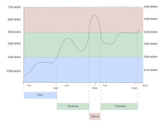
A more granular approach would be to track your effort distribution for one run, which is what most training platforms do. Again, to keep it simple, we will only look at three zones: easy, moderate, and difficult.

Effort distribution for one run.

This is often useful for looking at one run but, when you are training for an event, looking at an isolated instance is less than ideal. One 10 mile run could be broken into multiple segments within the same session to include a warm up, several pick-ups, a short tempo, and a cool down.

How would you quantify the contribution of each of these segments if you’re only looking at each run as a whole? This is where Training Bands do the hard work.

Training Volume by Effort

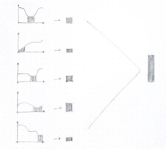
Smashrun looks at each trackpoint of every run and allocates it to a bucket, which we call a training band. It does this for pace, heart rate, and hill grade. Using our previous example, if we took all of the easy zones from a bunch of different runs and added them up across all runs, we will end up with one training band.

One training band.

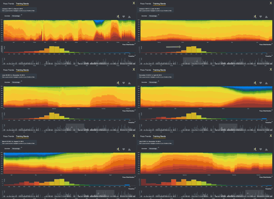
This becomes tremendously complex with actual running data, because one run could have thousands of trackpoints. Your entire training history could be hundreds of thousands of trackpoints. Each of those trackpoints go into a specific band. When you combine all the bands together, you get Smashrun’s Training Bands.

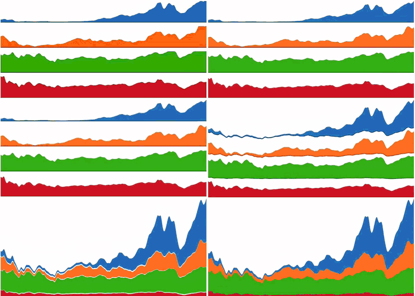
Another way of visualizing it is to look at individual area graphs, which you can actually do when you click on specific bands. Each color represents one band. When stacked together, they represent your total training volume.

Area graphs

Training Bands illustrate volume at a different level, because you are not just looking at total duration of all runs. Instead, you are looking at the total duration of runs at different training efforts. Whether you are viewing your Training Bands for pace, heart rate, or hill grade, each band represents how hard you performed, for how long, and for what percentage of your total training.

Combined with training volume based on heart rate zones, it is possible to use Training Bands to get a sense of your training load. This, of course, is not a direct calculation of your load. Instead, it is a quick way to visualize your effort distribution and training intensity over different training cycles.

Scrolling training bands.

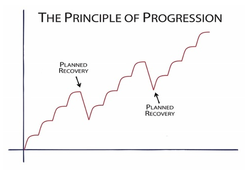
As I mentioned in last week’s post about using Pace Trends, overload (the tipping point at which you start to improve) happens with planned recovery periods.

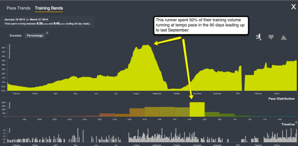
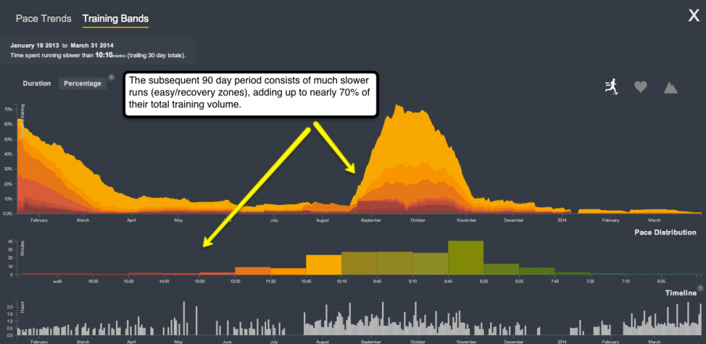
Use Training Bands to see when you spent more time running hard so you can better manage your future training volume.

% tempo

% easy/recovery

Identify the time periods when you did the most speedwork. Did it help your overall training? Or did it set you back because you were too burned out afterwards?

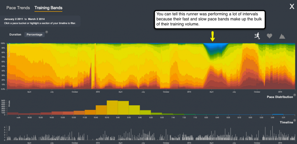
Intervals

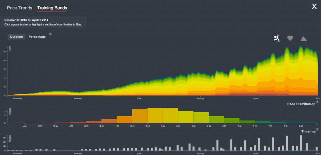
Have you ever wondered what someone’s training might look like if they stick to the 10% rule to gradually increase volume? It’s like something out of a textbook.

10% rule

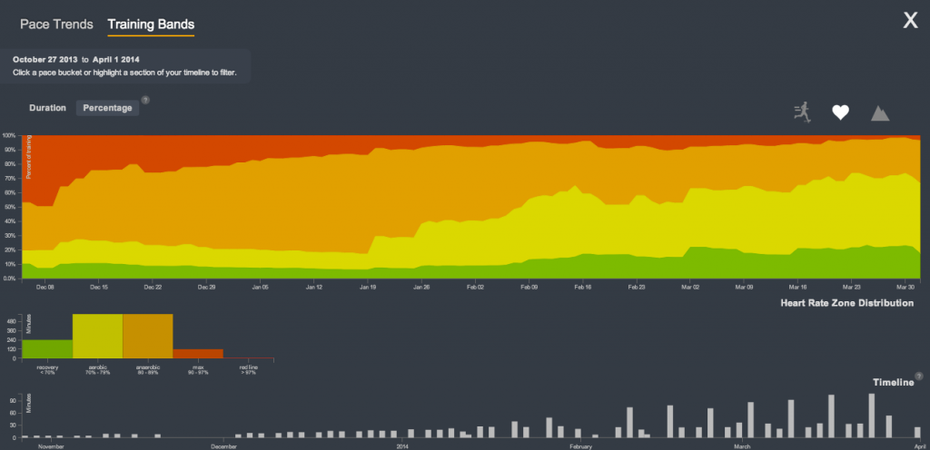
It gets even more interesting when we look at the same person’s Training Bands for heart rate, viewed as a percentage instead of absolute duration. You’ll see that they ran less in the beginning but spent a lot of time near their max, whereas they’re running much more now but spend much less time in the red zone. By running more, aerobic capacity just naturally increased, which is as it should be!

HR distribution.

Training Bands is really where Smashrun bridges the gap between small data (your individual runs) and big data (your total training duration by effort distribution). It is a much more meaningful representation of your training volume because it shows you how every second of every run contributes to your training as a whole.

How to Use SPI

Have you ever wondered how your fastest mile compares to your first half marathon? Or, wondered if your best 5K is better than your second best marathon time? How can you tell?

The Smashrun Performance Index (SPI) is a value derived from a performance curve to help you compare runs of similar effort across various distances. The thing to keep in mind is that SPI is only somewhat predictive.

The problem with many performance models is that they often only use finish times of elite male athletes as the baseline reference for the top percentile – not average runners but, world-record setting athletes. Their predictive quality can also deteriorate over longer distances, especially when you try to interpolate a marathon time from a very short distance, like 800 meters.

However, performance models can be useful for understanding relative improvements, assuming that the conditions for each new PR set is approximately the same.

The Purdy Points Model

In 1936, a table of finish times for elite athletes was compiled consisting of distances from 40 meters to 100,000 meters. Each of the performances were recorded as the top velocity reached while running in a straight line and were deemed equal and assigned an arbitrary baseline value. It is known as the “Portuguese Scoring Table”.

In 1974, it was updated by J. Gerry Purdy to reflect more recent world record times and added scaling factors to account for slowdown when accelerating to peak speed and on turns. This resulted in the Purdy Points Model, which provides the foundation for our SPI.

Why We Use Predictive Curves

Scoring tables are generally used as guides to help coaches predict their athlete’s performance for various distances on the track. It is, however, really important to remember that these models are not definitive indicators of actual times. Its main utility is that it can estimate your potential time for other distances, effectively providing you with a roadmap of where you’re headed.

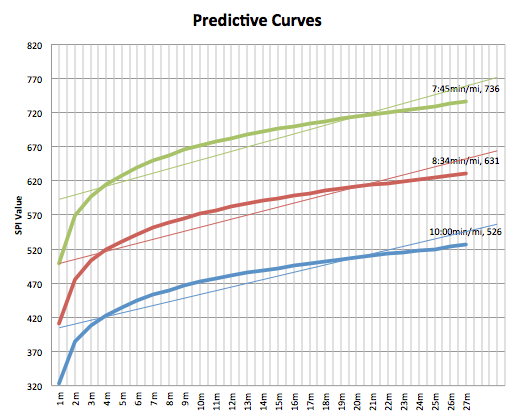
We use predictive curves mainly because it gives us a baseline for measuring individual fitness level. For example: here are three hypothetical curves based on a 10min/mi (6:12min/km), 8:34min/mi (5:19min/km), and a 7:45min/mi (4:48min/km) pace. You’ll see that, as your baseline pace for a mile improves, your predictive curve shifts upwards.

predictive_curves

You could also work backwards from the curve because once the SPI value for a given point is determined, you can back out of it what your approximate time might be for another distance. It’s how we calculate your estimated finish time on the By Run page.

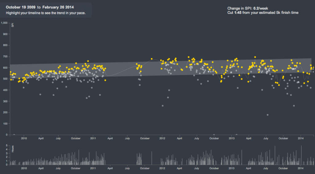
Additionally, Pace Trends looks at SPI to plot your three best performing runs on a rolling 30-day period (so 30 days from today and back). “Best” in this case can seem rather subjective but, again, as long as you’re comparing runs performed under similar conditions, it should remain fairly accurate.

Every Runner Has A Different Performance Curve

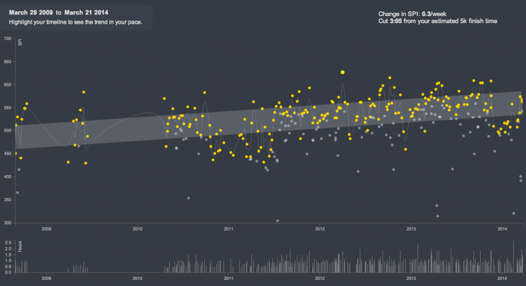
Your training history will affect the slope of your performance curve. Some runners might have a flatter curve because they’re already training near their peak so there’s less room for dramatic improvements, whereas beginners would see a more pronounced upward trend.

If you’ve been running for a while, your overall pace trend could be pretty stable.

level-pacetrend

If you’ve never run before or you just started running races, you’ll likely have a steeper slope.

steeper-pacetrend

Context Is Important

Living someplace flat and running mostly on roads would generally result in higher baseline SPI’s than living someplace hilly and running mostly on trails. That means it’s entirely possible to shift your predictive curve up and down. The takeaway is that a lower curve doesn’t necessarily mean you are less fit, you might just be training under more challenging conditions.

This is why it’s important to look at your pace trends within specific training periods. You can always select a section of your training history and isolate those periods to see how you improved. Looking at the big picture is useful, but you cannot always trend upwards. Point A to point B isn’t exactly a straight line, it’s more like a staircase.

2014-03-23_1822

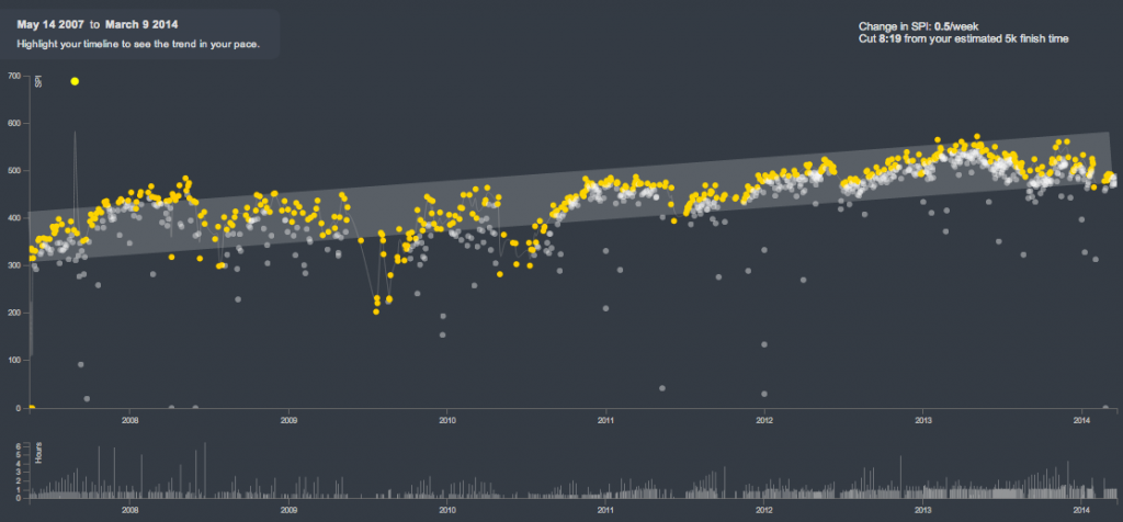
Here’s an actual example of one runner’s entire training history on Smashrun that demonstrates the principle of progression.

progressive-pacetrend

As you highlight sections of your pace trends and drag the time period over the years, you’ll see that there were probably several points in time when your pace trends looked a bit like the chart above. Context is a powerful thing. Use it to your advantage.

Ultimately, we would like to eventually be able to make certain adjustments like accounting for elevation gain/loss, adjust the baseline to reflect gender specific finish times, and maybe even adjust the curve based on age groups. Those will be likely be part of version two or three.

3 Tips for Using Smashrun’s Pro Map

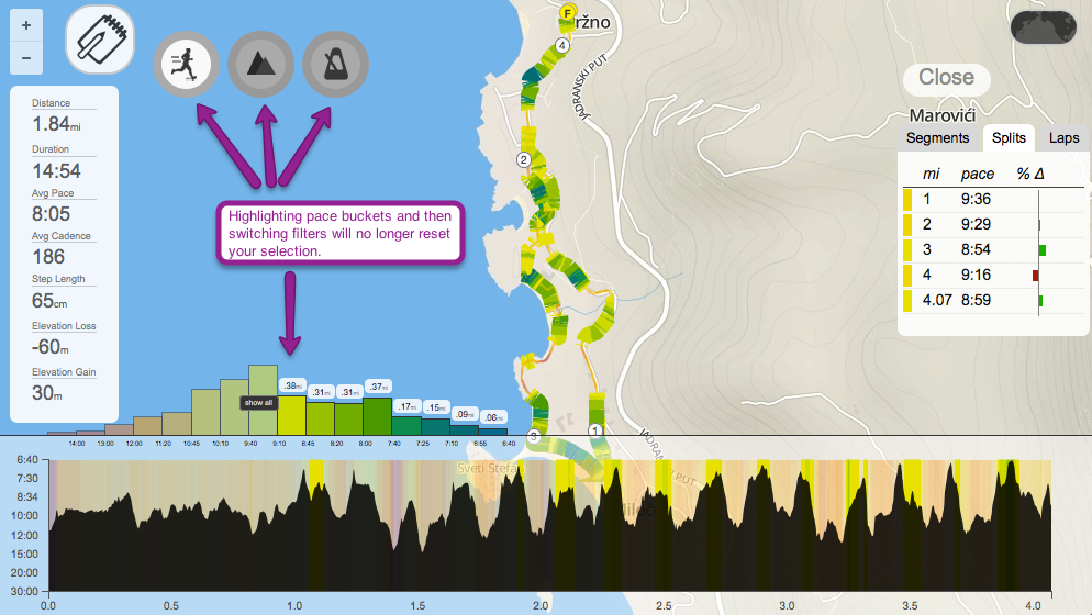
Before we designed the Pro Map, we asked ourselves: what sort of information is best conveyed while viewing the route of your run?

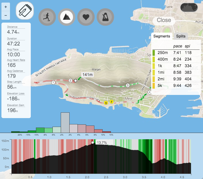
There’s the obvious metrics including your fastest split, the ability to see elevation changes and, a pace graph that you can interact with. All of these are helpful in the sense that they summarize exactly what you did. You know how fast you ran, how far, your average HR, cadence, etc. but, you don’t always know what contributed to your performance.

The Pro Map is designed to help you better understand the relationships between the different variables that affect your running. By looking at these relationships, you can identify your strengths and weakness for a given route. Here are some of the things I look at on a day-to-day basis after a run.

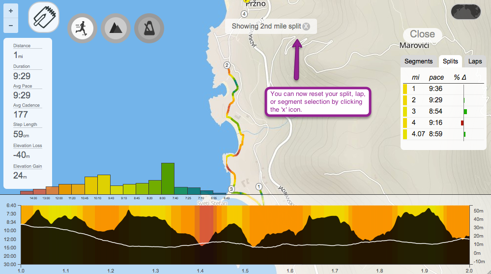
How Hill Grade Affects Speed

Chances are pretty good that you’ll slow down while running uphill and speed up on the downhill, whereas what you should do is maintain the same effort and stick as close as possible to your target pace as you go up and down the hill.

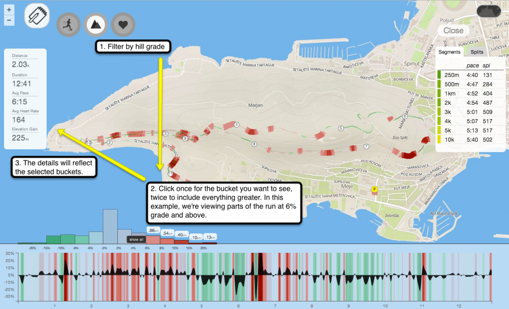
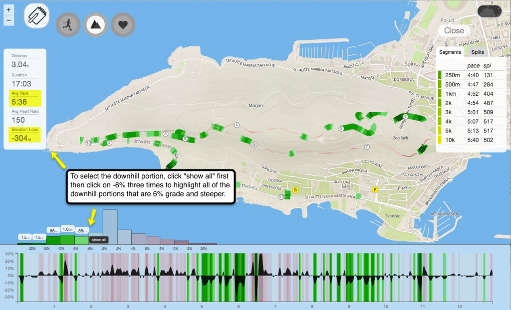
If you wanted to compare your speed for running uphill vs. downhill, you just have to look at your hill grade distribution, highlight the relevant %grade, and view the revised details on the left.

This is what it looks like when you select all of the uphill portions, 6% grade and higher, for a run.

2014-03-10_1111

To compare it to your downhill stats, just select the opposite side of the distribution curve – select the buckets that are -6% grade and lower.

2014-03-10_1118

You could also mouse over the pace filter while viewing your hill distribution to see how your pace changed at specific points during a run.

HR Recovery Between Intervals

Intervals, or repeats, are most effective when they’re executed consistently after every recovery. If, however, each interval goes slower than your last then you’re probably either overreaching or you need a much longer recovery period between each repeat.

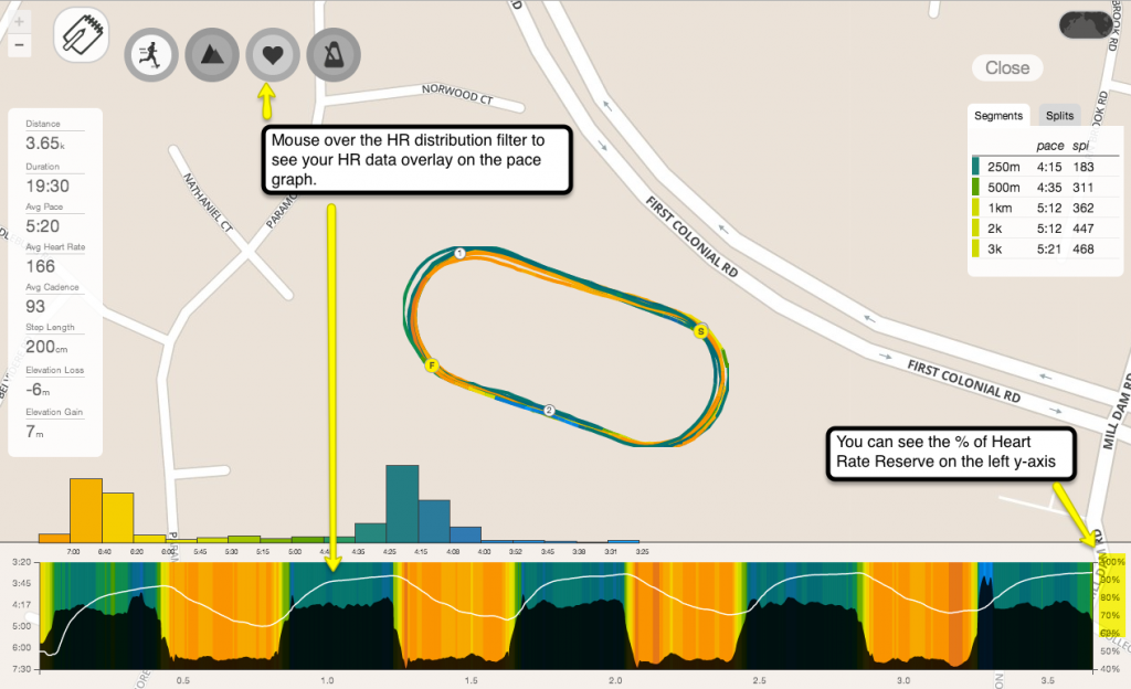
HR is one of the best indicators of recovery. When your HR isn’t recovering enough after each interval, it will pick up from a higher baseline than where you originally started on your first interval. That also means that you might not be able to perform as well at each repeat. If you do it right, it should look pretty consistent.

To see an overlay of your HR while viewing your pace graph, just mouse over the HR distribution filter.

2014-03-10_1137

You could also just view your HR graph and see how much time you spent at recovery vs. how much time your HR was greater than or equal to 90% of your Heart Rate Reserve.

Effect of Pace Variability on Cadence

A higher cadence is generally associated with improved running economy: the quicker your turnover, the less time you spend on the ground, and the greater your forward movement, which means less vertical oscillation or “bounce”. The tricky part is maintaining roughly the same cadence, regardless of changes in your pace.

With the exception of a few situations, such as a full-out sprint, a challenging trail, or a slow jog to warm-up, a steady cadence is usually a good indication of efficiency because it suggests that you’re expending approximately the same amount of energy regardless of pace.

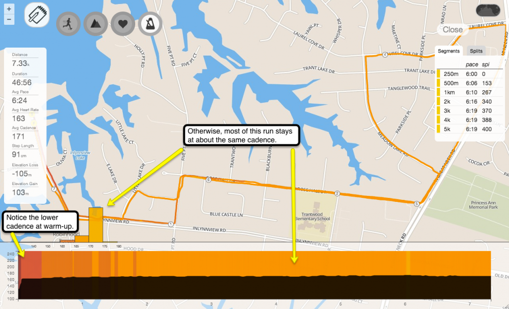
When you look at your cadence distribution, it should often appear almost like a straight line. Easy runs usually have the steadiest cadence like this one.

steady-cadence

The thing to keep in mind is that sometimes, it’s important to keep cadence steady to conserve energy. Just remember that, like everything else, it’s just another variable to help you evaluate your overall running efficiency. Here’s a quick brush-up on cadence and running economy: http://www.irunfar.com/2011/03/improving-running-economy.html

These are only a few of the things I tend to analyze using the Pro Map. You could also look at how your HR responds to hill difficulty or pace variability. Or view how your stride length changes depending on your cadence. How do you normally use the Pro Map? Let us know in the comments.

Got questions about other use cases? Send me an email at jacklyn@smashrun.com.

Nike patched and currency update

It’s 2am here at SmashrunHQ, and I’m thinking tomorrow morning’s run might have to become tomorrow afternoon’s run…

On the upside, the Nike import should be up and running again. If you continue to have any trouble at all please let us know and we’ll sort it out.

We’ve also added local currency pricing for Pro in EUR/GBP/AUD/CAD. So, if your bank’s international currency fees were causing you to hold off on the Smashrun Pro membership, then now’s the time. 😉

Nike Importer

It appears Nike+ has also made a few recent changes this week, which is now affecting Smashrun’s Nike importer. Unfortunately, if you’re a Nike+ user, this means you won’t be able to sync your data until we can release a patch but, we’re working as quickly as possible to resolve the issue.

Hide data, HRR, Garmin import, SSL

Early this morning, we released a patch and a couple of new additions that apply to both Smashrun and Smashrun Pro users. Let’s start with the new stuff!

Hide data before a certain date.

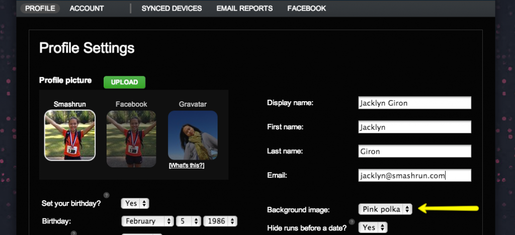
If you’ve ever taken an extended break from running or if you’ve ever used an app/device for a period of time that was uncalibrated/had erroneous data, hiding your runs before a certain date will help you “clean up” the stats displayed on your dashboard. You can set the date from your settings > profile page.

For example: the dashboard on the left shows long gaps in “Miles per month”. By setting a minimum date to display stats, the revised dashboard on the right zooms in on the consistent data and automatically updates all the summary details.

Before and After Overview Changes

If you’re a Smashrun Pro user, hiding data before a certain date will also flow through to the Analyze pages so it will affect your Pace Trends graph and the Training Bands. It’s tremendously useful if you’ve got suspicious data in the past that you’d like to ignore.

For example: these Training Bands reflect 6 years of training history. It includes training gaps, periods of training while injured, uncalibrated footpod data, etc.

Long Pace Distribution Curve

Here are the same Training Bands that only include data from 2013 to today, which is more representative of current fitness level and more pertinent to more recent training periods.

Shorter Pace Distribution

Enter Resting Heart Rate to calculate Heart Rate Reserve (HRR).

We’ve had a few Smashrun Pro users point out that looking at heart rate distribution based on max HR is far less accurate as a measure of training intensity than using heart rate reserve. As a result, we’ve added a field for resting heart rate within the settings > profile page. For many, the changes could be quite significant depending on the accuracy of your resting heart rate and max heart rate but, you can always edit both fields since they’re likely to change over time.

HRR will be reflected in all heart rate distribution buckets both within the pro maps and in the Training Bands.

SSL for login and account pages.

In addition to Smashrun’s existing security measures, SSL has been added to logins, new registrations, and account settings pages.

Updated the Garmin Importer.

Recent changes to Garmin Connect revised their authentication procedures so we had to update the way Garmin data is being imported.

Fixed goal setting for subsequent months.

There was a weird caching issue that was causing January’s mileage to appear as part of the mileage for February’s goals. That should no longer happen.

Garmin sync problems

For many users Garmin sync will be down until we make some updates. Hope to get these issues resolved as soon as possible, but in the meantime we recommend you download your runs as TCX or GPX files from Garmin and import them directly into Smashrun.

Introducing goal-setting version 1.0

Goal-setting is what bridges the gap between running casually and running purposefully. Whether you’re competing with your own personal best or toeing the line with other runners in an upcoming race, the first step to being ready is setting a goal.

For many runners, the most common type of goal is based on mileage. Some of us set a mileage goal for the year and we divide it as we see fit over the different months. Others prefer shorter-term goals and set their mileage at the beginning of each month. You can do both with Smashrun’s first goal-setting feature.

To set a goal, click on the prompt under the goal header:

set-mileage-goal

If you’re viewing your All Time stats, you’ll see the option to set a goal for the current month and the current year. If you’re viewing your 2014 stats, it will ask you for your 2014 goal and, if you’re viewing January, it asks for your January goal.

goal-details

Once your goal is set, unless you’ve got private stats, other runners will see it as well!

goal-is-set

If you’re a Smashrun Pro user, you’ll also know when you’re behind your mileage goal, because your number of miles in the progress bar will turn red and you’ll see an approximate value indicating where you should already be.

goal-missed

You can also edit your goals anytime just by clicking on it or, delete it by mousing over your goal and clicking the ‘x’ icon that shows up on the top right corner.

If you’re not yet ready to set a goal, no problem. It’s smart enough to know not to show up when no goals have been set, so other users don’t see it when they visit your profile. Although, you should really give it a try, because we’d like to see what sort of running goals you’ve got this year!

Smashrun PRO

There’s always been this gap. A gap between the experience of your run and the way you see your run through your data. You had the run of your life, but it was your first run through hills, so your pace was slower. You sprinted faster than you’ve ever sprinted at the end of that last race, but somehow the graph doesn’t really capture it. You know you’re getting in better shape, but you’re also running longer runs than you did before, so your average pace is getting slower.

These are all our problems. Smashrun and sites similar to ours have the very important job of remembering your runs, preserving your accomplishments, and giving you the insights you need to grow and improve. If that’s not happening, that’s our fault. That gap between the reality of all of those hard-earned miles and what gets recorded is our responsibility.

Smashrun PRO is designed to narrow that gap. You should feel great about your running. The truth is simple. With each and every run, you get better. You get leaner. You get stronger. You go farther with less effort. You learn and get smarter. Sometimes, it’s really hard to say how that last run mattered. What would have been the difference if you just stayed home? We built Smashrun PRO to show you that difference.

Of course, it’s just a start. We want to keep improving Smashrun and Smashrun PRO, but we don’t have big VC’s backing us (or even little VC’s for the matter). We’ve got you.

So, if you know someone who needs a last minute gift, maybe a founding membership to Smashrun might be pretty cool? They won’t need a subscription or a credit card, and we’ll be happy to personally sort out any problems they might have getting started.

In fact, it’s worth noting that none of the founding memberships auto-renew. We won’t ding you unless you ask to be dinged. We also know that times are tight, especially this time of year. If you can’t do Smashrun PRO right now, maybe you could suggest us to one of your friends, or post us on Facebook or Twitter or a forum, or anything. We’re crazy busy building more cool stuff and we need your help getting the word out.

For a list of the pro features, go here.

To vote on new pro features, check out Headliner Features.

Happy Holidays!

Chris, Jacklyn, and Steve

Arcos De La Frontera

A new direction

It wasn’t long after we first launched Smashrun before we had already started to formulate our ideas for The Next Big Step. Little did we realize then the sheer enormity of the scope of the project we were about to undertake or the scale of the commitment that it would require.

We filled notebooks with sketches. We diagrammed our ideas. We hashed out details over conversations that lasted into the wee hours of the night. And slowly, ever so slowly, our ideas began to take shape. We wrote project plans and architecture specs. And then we began developing and refining the technology that we would need to make it all possible.

But all the while, time…continued to pass. And as it passed we made decisions large and small that would allow us to optimize our lifestyle — decisions to maximize our productivity, to increase our man hours, and to multiply our efforts.

These choices ultimately led us on a path from NYC with its myriad glorious distractions and sky high cost of living, to a startup incubator in Chile. Then to the suburbs of Virginia Beach, and now finally to Arcos De La Frontera, where we’re making our new home while we’re arranging the final details, before taking the wraps off all that we’ve been working on.

Arcos? But why Arcos?

Arcos is our new home base, an Andalusian white town nestled precariously on a precipice and bounded by cliffs on two sides. It is a stupidly romantic place to base a startup. It’s infested with postcard worthy vistas, riddled with winding cobblestone streets, and flowers seem to dangle from every ornate cornice. The streets are literally lined with orange trees for the love of God! Speaking of whom, it’s worth noting that this tiny town of a mere 30,000 people has seven churches, and not one but two towering gothic Cathedrals. To be frank, it has all been a bit overwhelming, what with, coming here directly from the sprawl of suburban Virginia, with its comfortingly familiar landscape of strip malls and big box stores.

There is, of course, no Startup community. There are no VCs. And the nearest angel investor is probably a few hundred miles or more as the ridiculously romantic Arcos doves fly. But, of course, the beauty is we just don’t need any of that. We came here to build. Although, sometimes when explaining that to locals, we’re met with looks of bewilderment.

“Are you building a website about Arcos?”

“No. It’s about running.”

Pause..then sudden comprehension. “I see, of course, a website about running in Arcos!”

“Err…no it’s about running anywhere in the world.”

At this point it becomes clear, that our Spanish must be lacking, or they must have heard wrong. Because why would anyone come to Arcos to build a website?

Well here’s the answer. Arcos is that rare, and contradictory place in the world which is utterly inspiring, yet entirely devoid of distraction. Working into the evening there’s no tempting good time to be had. There’s nothing we’re missing out on. And during the day, although there are sites to be seen, we saw most of them in the first couple days after we got here.

However, (and this is the really amazing bit) if you need to clear your head, to see things from a different angle or to break through some mental funk the answer is simple: you just look out your window at one of those ludicrously scenic vistas, or you take a short walk around the ancient and timelessly beautiful block and, suddenly, you’re transported. Your thoughts coalesce. Your focus returns. And work proceeds with renewed vigor.

A crazy, mad, really quite very silly hill

And then, of course, there’s the running. Oh man, is there some running here. There’s this one hill that leads up the side of the cliff face to the cathedral. We’re using that hill to calibrate a “Level 9” hill difficulty on Smashrun. It kicks off at a 20% grade, and only rarely lets off, but the bit that’s not over 20% grade is hardly noticeable. Well, what with all the the sweat dripping in your eyes and the light-headedness precipitated by oxygen deprivation.

Each time I run this hill, I make it just a few steps farther than I did the last time before I have to start walking. Let me say that again. Before I have to start walking. No. Not slow down, not dig deep and find my inner champion, but walk….slowly…very slowly. And, when I start walking (very slowly) I don’t start running again, because quite frankly, I would have a heart attack and I would die on the spot. And then I would roll head over heels for next 10 minutes until I reached the bottom of the hill. And then this hill, this level 9 hill, would probably send a boulder rolling down after me and crush me with a kind of grim finality usually reserved for cartoon characters and blockbuster movie villains. You know, because, there’s a slim chance that some prospective hero who knew CPR might be happening by, and this is a hill that doesn’t take chances. It is just that kind of a hill.

Anyway, this is really just meant to be an address update blog post, but I seem to have gotten a bit carried away. If perhaps I haven’t painted quite a clear enough picture in your mind you could watch this video.

Readers note: I actually can’t say aloud, or even think the word Arcos for that matter, without doing it in the accent of the narrator of this video. “ARRRRRCos!” It’s just perfect.