We pushed out a few new features yesterday. The big one is that we’ve improved the usability of Smashrun on your phone’s mobile browser. It’s only a step, but a fairly big step. It used to be that Smashrun worked great on mobile for anyone with extremely tiny fingers, 60/20 eyesight and an 8″ or larger phablet. But as of yesterday all that changed. Now you can totally get by with 20/20 eyesight. In this release:
- Your run syncs automatically the first time you open the browser.
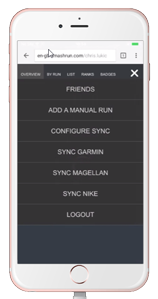
- The most used features have found their way into a hamburger menu
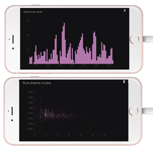
- You can click to zoom into the more detailed charts.
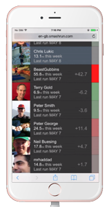
- The friends view might actually be better on the phone than the desktop.
That said, this is definitely a half step. It’s a long way short of a full blown mobile app, and the main dashboards are still configured the same way as they are on the desktop, so less than ideal for the mobile form factor. But progress is progress, and we’re hoping that this will take some of the pain out of using Smashrun on your phone. Meanwhile we’ll continue to work to make things even better. Please be sure to send us any bugs you encounter or issues with particular phones. We’ve done a fair bit of cross platform testing but we’ll definitely need your help to get it to 100%.
We’ve also bundled in a few other small but pretty cool things…
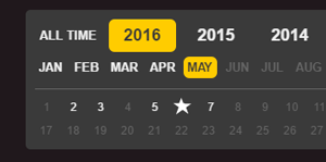
Your races now show up as stars on the calendar navigation.
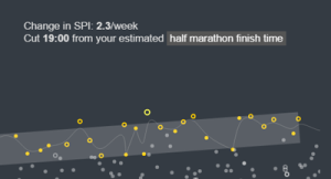
And for Pro users they show up as circles on your pace trends.
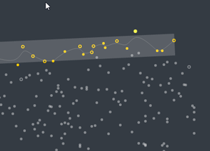
And while you’re on the pace trends you can now change your reference time to see relative improvement over a variety of set distances.
In addition we’ve patched over 2 dozen bugs, and undoubtedly introduced a few more, so please give us a heads up if you encounter any.
Keep your eye out for a direct TomTom integration in the next couple weeks.