Have you ever wondered how your fastest mile compares to your first half marathon? Or, wondered if your best 5K is better than your second best marathon time? How can you tell?
The Smashrun Performance Index (SPI) is a value derived from a performance curve to help you compare runs of similar effort across various distances. The thing to keep in mind is that SPI is only somewhat predictive.
The problem with many performance models is that they often only use finish times of elite male athletes as the baseline reference for the top percentile – not average runners but, world-record setting athletes. Their predictive quality can also deteriorate over longer distances, especially when you try to interpolate a marathon time from a very short distance, like 800 meters.
However, performance models can be useful for understanding relative improvements, assuming that the conditions for each new PR set is approximately the same.
The Purdy Points Model
In 1936, a table of finish times for elite athletes was compiled consisting of distances from 40 meters to 100,000 meters. Each of the performances were recorded as the top velocity reached while running in a straight line and were deemed equal and assigned an arbitrary baseline value. It is known as the “Portuguese Scoring Table”.
In 1974, it was updated by J. Gerry Purdy to reflect more recent world record times and added scaling factors to account for slowdown when accelerating to peak speed and on turns. This resulted in the Purdy Points Model, which provides the foundation for our SPI.
Why We Use Predictive Curves
Scoring tables are generally used as guides to help coaches predict their athlete’s performance for various distances on the track. It is, however, really important to remember that these models are not definitive indicators of actual times. Its main utility is that it can estimate your potential time for other distances, effectively providing you with a roadmap of where you’re headed.
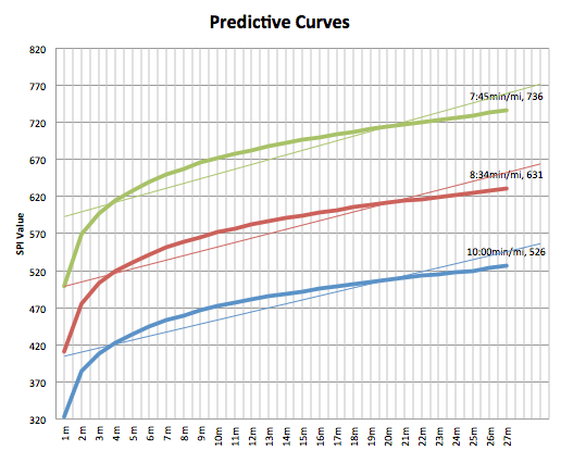
We use predictive curves mainly because it gives us a baseline for measuring individual fitness level. For example: here are three hypothetical curves based on a 10min/mi (6:12min/km), 8:34min/mi (5:19min/km), and a 7:45min/mi (4:48min/km) pace. You’ll see that, as your baseline pace for a mile improves, your predictive curve shifts upwards.
You could also work backwards from the curve because once the SPI value for a given point is determined, you can back out of it what your approximate time might be for another distance. It’s how we calculate your estimated finish time on the By Run page.
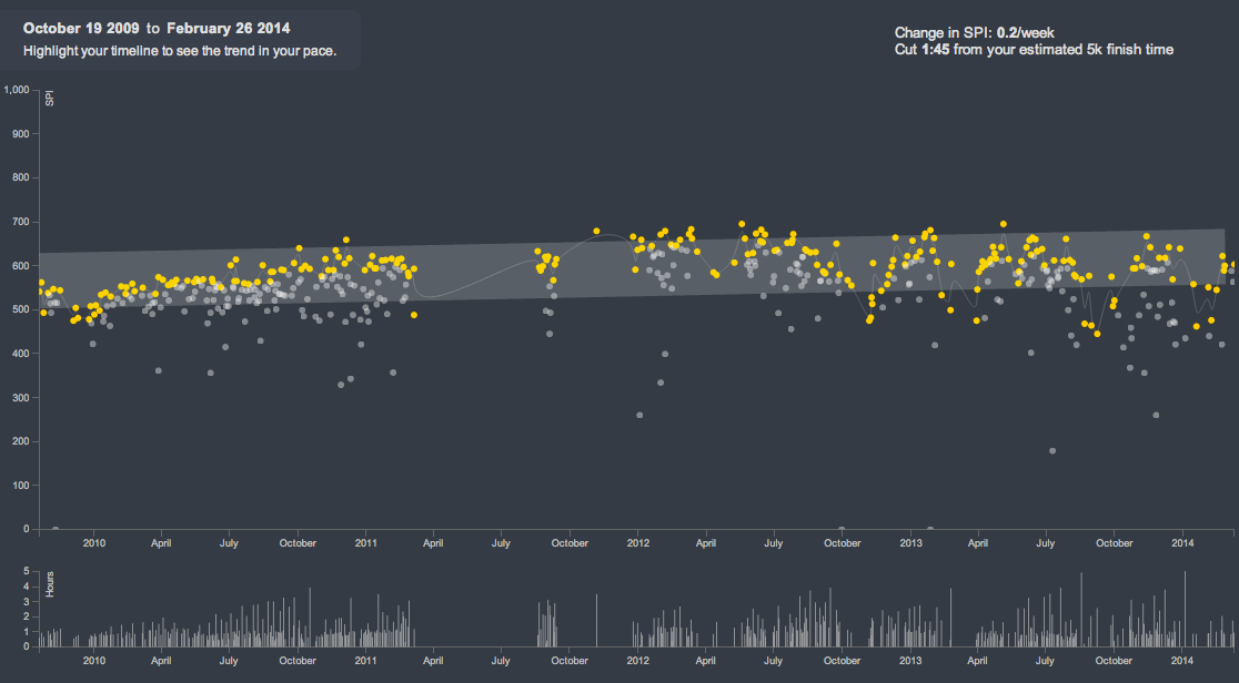
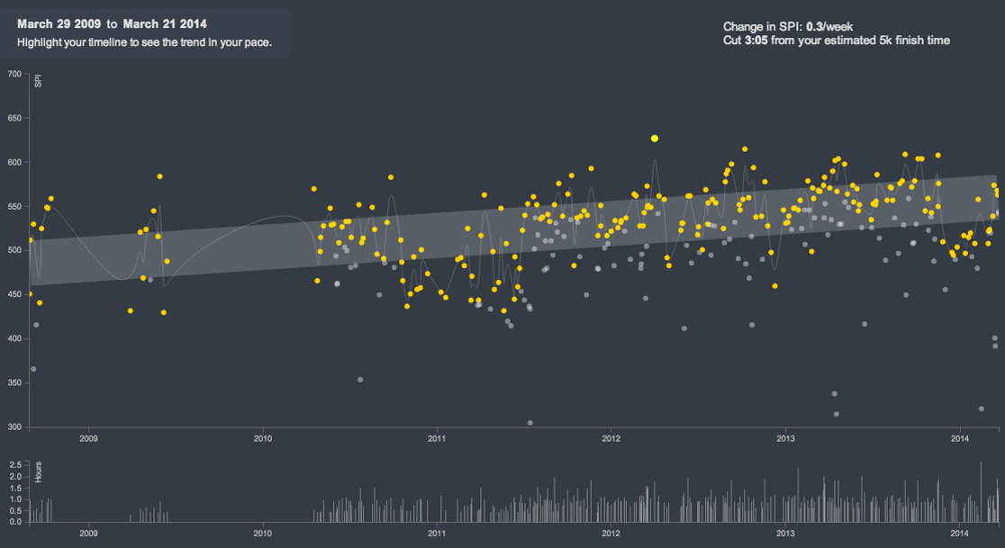
Additionally, Pace Trends looks at SPI to plot your three best performing runs on a rolling 30-day period (so 30 days from today and back). “Best” in this case can seem rather subjective but, again, as long as you’re comparing runs performed under similar conditions, it should remain fairly accurate.
Every Runner Has A Different Performance Curve
Your training history will affect the slope of your performance curve. Some runners might have a flatter curve because they’re already training near their peak so there’s less room for dramatic improvements, whereas beginners would see a more pronounced upward trend.
If you’ve been running for a while, your overall pace trend could be pretty stable.
If you’ve never run before or you just started running races, you’ll likely have a steeper slope.
Context Is Important
Living someplace flat and running mostly on roads would generally result in higher baseline SPI’s than living someplace hilly and running mostly on trails. That means it’s entirely possible to shift your predictive curve up and down. The takeaway is that a lower curve doesn’t necessarily mean you are less fit, you might just be training under more challenging conditions.
This is why it’s important to look at your pace trends within specific training periods. You can always select a section of your training history and isolate those periods to see how you improved. Looking at the big picture is useful, but you cannot always trend upwards. Point A to point B isn’t exactly a straight line, it’s more like a staircase.
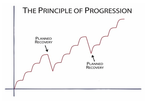
Here’s an actual example of one runner’s entire training history on Smashrun that demonstrates the principle of progression.
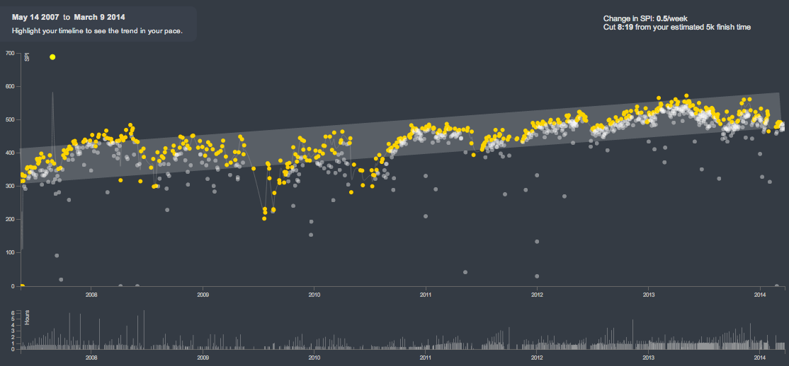
As you highlight sections of your pace trends and drag the time period over the years, you’ll see that there were probably several points in time when your pace trends looked a bit like the chart above. Context is a powerful thing. Use it to your advantage.
Ultimately, we would like to eventually be able to make certain adjustments like accounting for elevation gain/loss, adjust the baseline to reflect gender specific finish times, and maybe even adjust the curve based on age groups. Those will be likely be part of version two or three.