Splits on the by run page

We’ve just added splits to the by run page. Check it out there’s pretty spiffy animation.

splits-606x376

You can also easily highlight and scrub across to see multi-mile/km splits. And pro users can see their elevation splits as well and open up any split in the Pro Map for further analysis.

Tag Cooper tests for VO2

Cooper test

Cooper test

A Cooper test is a benchmark run that you can use to estimate your VO2 max. It’s pretty simple. You go to a track. Then, well, you just start running like a crazy person until the 12 minutes are up. That’s pretty much it.

The problem is that unless you’re a professional athlete running 12 minutes at maximal effort will pretty much grind you to dust. Don’t even consider doing it if you have the slightest worry about your heart, or if you still have weight to cut, or if you’ve recently recovered from an injury. But if you’re feeling pretty good about you’re training a Cooper test will set an important benchmark, when you look back for years to come you’ll know the answer to what you were really capable of.

If you’re a Smashrun pro user you can tag your run as a Cooper Test and you’ll get a special view of your run on the by run page. You’ll see an estimate of your VO2Max, and a rating of your VO2 Max based on your age/gender. You’ll also be able to compare this Cooper test to other ones you’ve run in the past.

This week we also added a new setting on the profile page to make all of the labels brighter on the report pages. When you set it, the pages might be a little less clean looking but they’ll definitely be easier to read.

High contrast labels

Interactive Overview and Weekly Stats

We’ve added a new visual layer to Smashrun’s Overview pages! Now you can interact with the distance charts, Trailing mileage charts, Runs distance vs. pace, and an infinitely more useful version of Days run vs. days without.

The interactivity should provide more transparency to your data so you can actually dig in and discover additional metrics such as number of runs, average pace in different time periods, % of runs above a certain distance or pace, without ever having to leave your Overview page. Here’s the detailed rundown.

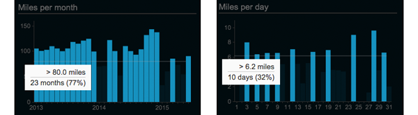
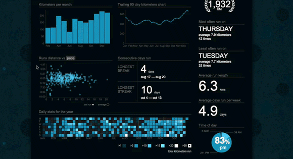
Miles/kilometers per month/day

Miles/km per month/day

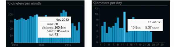
Mouse over any of the bars within Miles/Kilometers per month to see number of runs, total distance, and average pace. Average SPI will also show up for Smashrun Pro users. If you click on a given month, it will take you to that month’s overview page. Likewise, if you’re on the month view and you click on a day, it will take you to the run.

In addition, you can also mouse over the values along the y-axis, to see which percentage of your runs (or which months/days) are greater than a certain distance. This allows you to get a better sense of your base mileage – plus, it’s kind of interesting to see how much of your monthly volume or daily runs are above or below a certain distance!

Miles/km y-axis

Trailing mileage charts

This has always been a bit tricky to explain. Because it’s “trailing”, any given point along a trailing mileage chart is the cumulative result of a preceding period. In other words, it’s a rolling total distance.

Any point within the All Time view will show the period of one year, points within the yearly view will show the trailing 90-day period, and points within the monthly view will show the trailing 7-days.

Now that you can interact with the trailing mileage charts, you can actually see which months/days contributed to any point within the chart. You’ll also see which runs are included on the Miles/km per month, Runs distance vs. pace, and the daily/weekly stats calendar.

Trailing Mileage Chart

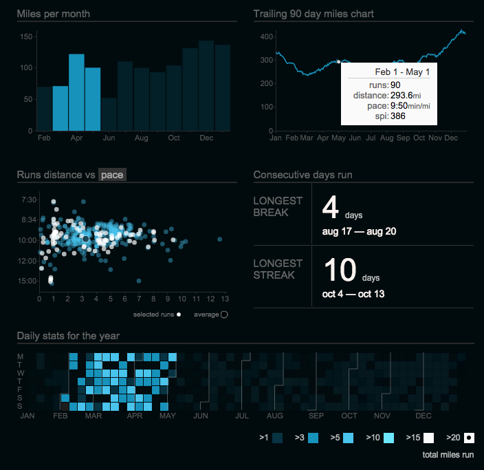
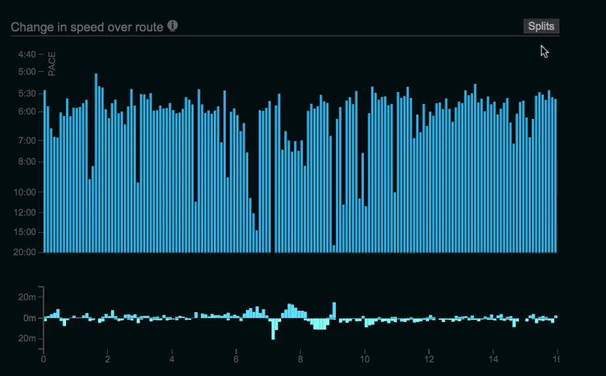
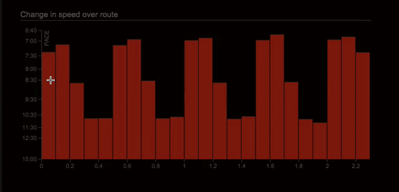
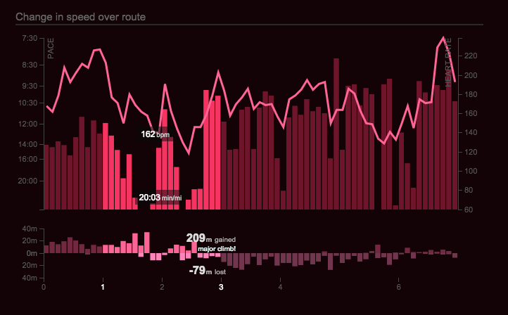
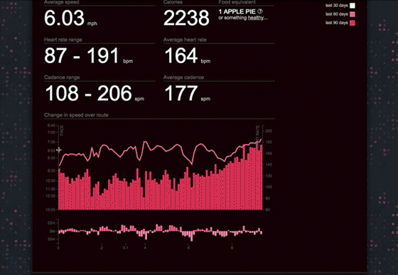
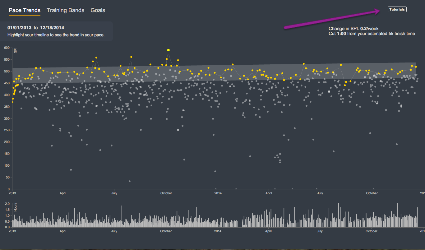
Runs distance vs. pace/SPI

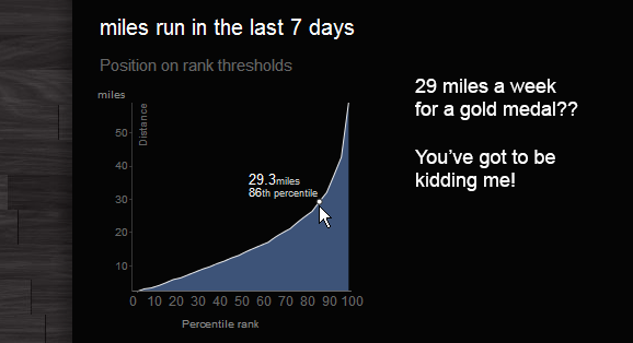
Runs distance vs. pace chart (the scatterplot) now shows the % of runs faster than a certain pace and/or greater than a certain distance. This will give you a much clearer understanding of your run distribution. You can now also select a run from within the scatterplot and it will take you to the By Run page.

Move your cursor over the y-axis values to see what percentage of runs are faster than a certain pace. Mouse over the x-axis values to see what percentage of runs are longer than a certain distance. To see runs greater than a certain distance and pace, move your cursor within the scatterplot.

Runs distance vs. pace

For Smashrun Pro users, you can switch the scatterplot to display Runs distance vs. SPI. This will help you compare your runs based on performance instead of average pace.

Switch to SPI

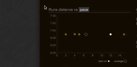
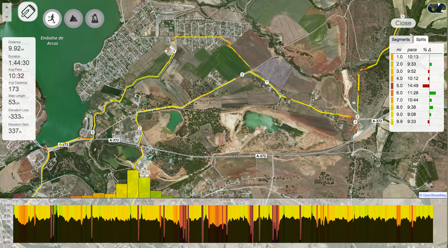
So if, for instance, you wanted a quick and easy way to spot your 10 best runs this month (or top 10 runs for the year or even all time!), now you can. And you can click on the run within the scatterplot to view its By Run page.

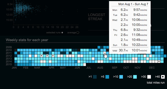
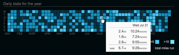
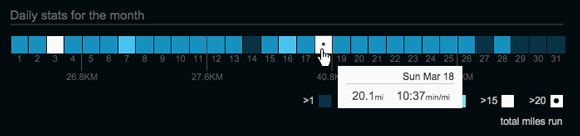
Weekly and Daily stats for the year/month

We replaced Days run vs. days without with a calendar heat map that visualizes your weekly and daily training volume. The colors will help you distinguish between the high and low volume weeks or days, which can be really useful when you’re reviewing your training history and you want to figure out in which weeks or days you ran the most. All you have to do is mouse over the distance brackets.

Select distance brackets

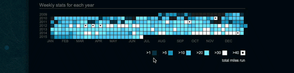
In the All Time view, it shows your weekly stats for each year. From this, you can see in which years you might have been training for an event like a marathon, because you’ll spot the high mileage weeks in white.

All Time Weekly Stats

In the yearly view, you’ll see your daily stats for the year. Each day of the week has its own row. Because of this, you can answer questions like: on which days do I run the least distance or when do I usually run long?

Daily stats for the year

In the monthly view, it’ll be the daily stats for the month, which includes the total distance for each week (just after every Sunday).

Daily stats for the month

There were many breaking changes in this release, so please keep us posted and send us an email at hi@smashrun.com if you encounter any issues.

Other big changes…

  • Importer – if you’re importing multiple runs for the same day (e.g. if you ran twice today), both runs will get imported at the same time whereas before every run entered the main import queue
  • Prompt to publish – if your FB post preference is set to “prompt to publish” and you just imported multiple runs, the prompt will always default to the longest run that you just imported instead of the last run that was imported
  • Same logic above applies to auto-publish
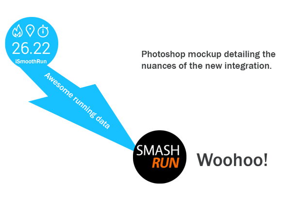
  • iSmoothRun/Run.GPS users, and anyone importing via email: you should now get prompt to publish and post-import notifications
  • Import via email – the “you’ve got mail” notification now only shows up once when bulk importing > 20 runs, otherwise you’ll just get the “we successfully imported your run” modal
  • Multi-sport – you can now retrieve the run portion(s) of a multi-sport activity from Garmin Connect (yeah!)

We also recently updated the running apps page to reflect recent testing with Android apps and Windows Phone apps, and, in case you missed our last post, Smashrun is now integrated with RunGap (which can help you retrieve your stats from Strava and Suunto, among many others, and into Smashrun).

RunGap Integration

run-gap-smashrun

If you’re looking for an easy way to import your stats from Suunto, Endomondo, Strava, Polar, or Runkeeper into Smashrun, RunGap with Smashrun support is now available from the iTunes App Store. It’s a workout tracker that lets you consolidate your complete training history and back it up as you like. To export your data to Smashrun you’ll need to first unlock the “Swag Bag” ($.99 / 3mo) which will give you the ability to export directly to a large variety of apps, to save GPX/TCX files, and send data directly to other iOS devices locally or remotely via Airdrop.

How it works

First, you need to grab your existing activities from the app(s) you’re using. Under RunGap’s Tools section, select “Accounts & Settings” and add your app(s) including Smashrun.

RunGap

Once your activities have imported into RunGap, select the menu > click on “Share & Export” > and choose Smashrun and any other sites you use. That’s all there is to it.

RunGap

It’s a brand new integration, so if you come across any problems, don’t hesitate to reach out to support@rungap.com or hi@smashrun.com and we’ll sort it out.

Facebook!

Update (May 11 – 2:13PM EST): We got the approval from Facebook. It appears to have already worked for several users. Please let us know if you’re still having trouble!

So, we’ve managed to track down what’s been going on with the Facebook integration. Facebook requires an internal review of

any apps that request special permissions. We submitted the Open Graph fitness.course action for review and we were approved quite some time ago, but it seems with the new API we need to also submit the “publish post” action for review as well. What that means is filling out a form and wait 5-10 business days and hoping for the best. So that’s…a little disappointing.

In our QA environment we don’t need approval for these actions, nor do we need approval for any admin accounts in Production. So everything always worked just fine for us. But for everyone else the Authorize to Publish function just opens a window and hangs there, because Facebook hasn’t approved us yet. So it was pretty much a worst case testing scenario.

On the upside, in our zeal to get to the bottom of it, we’ve released 3 separate patches in the last 5 days to fix every other esoteric Facebook flow problems we could find.

Apologies for screwing this one up,

Chris, Jacklyn, and Steve

Interactive pace chart

We’re continuing to work our way through all the charts on Smashrun, making them interactive one by one. This weekend, we’re updating the pace chart on the bottom of the By Run page. It’s been a staple since Smashrun began, but it’s always been, let’s face it, kind of underwhelming. It’s a bar graph with pace, no more no less. We discussed ripping it out and starting fresh, adding some textures, and shadows, maybe a cute little bubble tooltip and a couple of gradients here and there.

Then we sobered up the next morning, and came to our senses. We realized that old run chart is a classic. It’s a pair of tried and true NB 574’s. Understated, free of pretense. It says how fast when. No animated bubble tooltip required. But we thought, what if we took that old classic and dropped a brand new engine in it?

Say hello to your new run chart. It’s just like the old run chart. But behold! It does stuff.

Scrubbing Pace Chart

Mouse over your run graph, click and drag to select an area of your run. You’ll immediately see the average pace for the selected area. You can drag your selection, expand or reduce it, and see how your pace changed over various splits. The nice thing is that you can see any split you want. You can, for example, compare each 10k split of a marathon, or the pace of each effort and recovery over a set of intervals.

This new functionality is available for all users Pro and Free alike, but we cooked up something extra if you’re a Smashrun Pro user. We’ve added an elevation gain/loss chart just below the run chart. You can use this to find the elevation gain of individual climbs and descents, and compare your pace and average heart rate.

Elevation Gain/Loss Graph

And when you double click any section it’ll open up in the pro map for further analysis.

Interactive Pace Chart Pro

We also took this opportunity to earn a few more grey hairs by doing some serious data reconciliation. We coded the run graph in one programming language, and the pro run map in another, so we could reconcile between them. With pauses, floating points rounding issues, and intermittent data this was no small feat. To make this all happen, we’ve also started interpolating meaningful trackpoints (if your watch records a point at 1.96km and at 2.07km, we estimate your pace/HR/cadence at 2.0km). We’ve added some minor GPS error correction, and we’ve revised our elevation calculations to use more sophisticated resampling and error correction techniques.

This was all, of course, a total, utter, and complete nightmare. And there’s no doubt that with millions of runs now in the system, you’re going to run into at least a few issues. Let us know what you find and we’ll sort it out.

Also there’s a terrifying new color picker by Megan Zombie.

PS: Some runs imported on Sunday will have incorrect calories. We’re working on correcting these. But any new runs imported starting Monday should be okay!

iSmoothRun integration

iSmoothRun is one of our favorite running apps for the iPhone. It’s also one of those rare fitness companies that we feel has its priorities right.

They’re not trying to take over the world – to monetize your running tracks, slurp up your health data, or become the Facebook of fitness. It’s just a great app for runners that makes it easy to send your data to any site you want. It’s also, as of today, directly integrated with Smashrun.

What that means is the data quality is going to be really tight and there’s no more worrying about syncing or emailing your runs. It should just work. It’s also 50% off right now and I can think of a lot of worse ways to spend $2.99 $5.99.

iSmoothrun to Smasrhun

Special thanks goes out to Neil and the other beta testers who really went the extra mile helping us work out the kinks in the interface.

If you run into any problems or notice anything that’s less than perfect just shoot an email to us at hi@smashrun or to iSmoothrun and we’ll work to get it sorted out.

Garmin is back! New features!

It was a tough 48-hour period, but the Garmin Connect importer is now fixed. As many of you know, Garmin’s been busy rolling out a lot of changes to their site over the past few weeks. We’ve adapted our code and everything should now be 100%. If you’re still having trouble, shoot us an email and we’ll investigate.

Naturally, we were caught in between working on some existing features and rolling out new ones, while patching the importer. So, we had to wrap things up. And voila! New features.

Our very hilly stomping ground for SmashrunHQ.

New Maps: Trails and Satellite View

We’ve added a new trail focused map that includes enhanced elevation and terrain data. If you run a lot of hills or trails this is going to be your new “go to” map.

Our middle-of-nowhere run in Andalucia.

In addition, we added the Satellite map. It was silly not to have it on Smashrun before, especially, considering how useful it is for orienting yourself before and after a run. Besides, it makes the Smashrun Pro map look even better!

You’ll get a guider the next time you click on your route, explaining how it works. Basically, when you open up a route, you can mouse over the globe icon on the top right of your route map to switch styles.

The next step will be unlockable map styles. Maybe even a treasure map, maybe even with hidden badge locations. Maybe.

Interactive Charts and Graphs for Ranks

We are currently in the process of making every single chart on Smashrun interactive. Most of the charts will look pretty much the same, but we’ll be adding additional layers of detail.

We started with the Ranks section, so now you’ll be able to gain some useful insights just by mousing over them…

Ranks Ranksaster

We’ll be working through these interactive charts bit by bit, while all the while doing our best to stay on track with the other features we’re getting ready for Spring. And who knows, it’s even possible that the mythical shoe tracker might make an appearance…of course first we’ll have to dust off our notes from early 2014.

Update (Feb. 15 – 2:36PM GMT+1): It looks like the new Garmin API no longer buckets all run activity types under “Running”. Instead, they’re all getting passed as the specific run activity type. If you get “no new runs found” when trying to sync, it’s because you have a run categorized as Treadmill/ Track/ Trail/ Street Running. You can either change the activity type to just “Running” and they should all import. Or, if you can hold off a bit longer while we prepare the patch, we’ll fix it so that you can import your runs as is!

Update (Feb. 15 – 9:38PM GMT+1): All fixed! Everyone should now be able to import their runs without any problems.

Garmin importer currently down

There is currently a problem with the Garmin importer and we are looking into it. For any users who sync their runs via Garmin Connect, please hold off from clicking ‘sync’ until we’re able to diagnose and patch the issue. We’ll keep everyone up-to-date as we learn more.

In the meantime, you can still export your GPX/TCX file from Garmin Connect and import it to Smashrun either manually or via email.

New Tutorials

With so many new faces around here, thanks to our December buy pro/give pro promotion, we thought it’d be helpful to create a couple of quick tutorials to get everyone acquainted with their new pro accounts.

Training Bands – learn how to highlight different training bands in different periods and understand what they mean contextually.

Pro Map (a refresher from the Smashrun Pro page) – a quick summary of the features within the pro map including fastest segments, splits, SPI, change in pace over distance, and map filters.

Progress Towards Goal – how to use Progress Towards Goal to stay on track and help manage your training schedule.

Pace Trends – an overview of how we generate Pace Trends based on SPI and how to use it.

You can access the tutorials on the top right of the Analyze section (shown below).

Tutorials Button