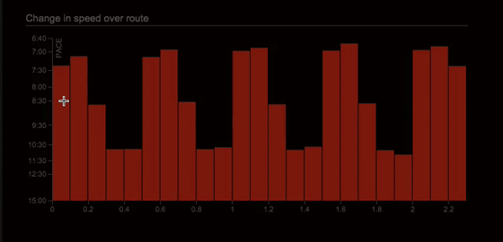
We’re continuing to work our way through all the charts on Smashrun, making them interactive one by one. This weekend, we’re updating the pace chart on the bottom of the By Run page. It’s been a staple since Smashrun began, but it’s always been, let’s face it, kind of underwhelming. It’s a bar graph with pace, no more no less. We discussed ripping it out and starting fresh, adding some textures, and shadows, maybe a cute little bubble tooltip and a couple of gradients here and there.
Then we sobered up the next morning, and came to our senses. We realized that old run chart is a classic. It’s a pair of tried and true NB 574’s. Understated, free of pretense. It says how fast when. No animated bubble tooltip required. But we thought, what if we took that old classic and dropped a brand new engine in it?
Say hello to your new run chart. It’s just like the old run chart. But behold! It does stuff.
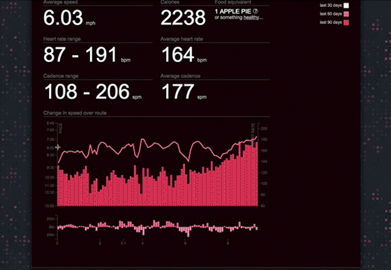
Mouse over your run graph, click and drag to select an area of your run. You’ll immediately see the average pace for the selected area. You can drag your selection, expand or reduce it, and see how your pace changed over various splits. The nice thing is that you can see any split you want. You can, for example, compare each 10k split of a marathon, or the pace of each effort and recovery over a set of intervals.
This new functionality is available for all users Pro and Free alike, but we cooked up something extra if you’re a Smashrun Pro user. We’ve added an elevation gain/loss chart just below the run chart. You can use this to find the elevation gain of individual climbs and descents, and compare your pace and average heart rate.
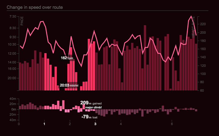
And when you double click any section it’ll open up in the pro map for further analysis.
We also took this opportunity to earn a few more grey hairs by doing some serious data reconciliation. We coded the run graph in one programming language, and the pro run map in another, so we could reconcile between them. With pauses, floating points rounding issues, and intermittent data this was no small feat. To make this all happen, we’ve also started interpolating meaningful trackpoints (if your watch records a point at 1.96km and at 2.07km, we estimate your pace/HR/cadence at 2.0km). We’ve added some minor GPS error correction, and we’ve revised our elevation calculations to use more sophisticated resampling and error correction techniques.
This was all, of course, a total, utter, and complete nightmare. And there’s no doubt that with millions of runs now in the system, you’re going to run into at least a few issues. Let us know what you find and we’ll sort it out.
Also there’s a terrifying new color picker by Megan Zombie.
PS: Some runs imported on Sunday will have incorrect calories. We’re working on correcting these. But any new runs imported starting Monday should be okay!
Looks very nice! 🙂
very nice indeed!
Love the update. You guys are super-duper-awesome as ever. I shall forever be holding you as running-stat idols. May this site live forever. X
Despite this little Calories calculation issue, everything seems to work fine. You guys made a good job!
NB (small bug report):
if I select a specific area of my run and open a Pro map to visualize the data, there is no easy way to show the Pro map for the entire run again (If I click anywhere else on the chart to get rid of the current split, it won’t bring back the map for the entire run. I have to create manually a split of the full run to get the full map back).
Hi Greg – when you double click the segment and it opens up within the pro map, you should see a label across the top of the map indicating what segment is being shown. Just click the ‘x’ next to it and it’ll show the entire run again.
Thanks Jacklyn! I haven’t noticed it, sorry about that.
Not sure if it’s related to the calorie bug but my run today shows a ridiculous pace spike which has thrown out the pace graph, even thought the overall stats look ok (apart from the calories of course.
There were a couple of pauses in that run but, one in particular, had a really bad GPS outlier that threw off the pace graph since the scale is relative to the fastest and slowest pace for that given run. If you send us the GPX file that you uploaded, we can figure out exactly what’s wrong!
As with all changes, it looks like you had to remove a few features with the update. Specifically, the “fastest mile” isn’t automatically selected, and the graph of the continuous heart rate is gone. Just mentioning it in case they weren’t supposed to go away. 🙂
We had debated what to do about the “fastest mile” – we can bring it back, but it’s now a bit trickier to implement with the new code we’re using to generate the chart. It was either keep it and delay the new functionality release, or release version 1 and circle back with version 2. But we did just figure out a way to add it back, so we’ll work on that.
The graph of the continuous HR, however, should still be visible. That’s not intentional if it’s missing from your runs. Can you email us with an example of a run that’s missing the HR graph and include the GPX/TCX file for the run?
I’m sorry I hadn’t read this sooner. The HR is back, AND it is better than ever. Don’t think I’ll miss the auto-fastest run. Really diggin’ the new interactive graph. It’s a little tricky on touch devices, but works perfectly on desktop.
Hi Jacklyn, Just wondering when the fastest KM/M will be released as you indicated above that you had figured out a way of adding it back, I know I can drag the section across for a 1KM length and then scroll through my run to get the detail but having it highlighted immediately is just so much smoother.
Great work! Love it! – next update I want to make crop of the run in the pro map window. It is not easy to finetune from run graph.
Hi! Question for you. With your new interactive pace chart, shouldn’t my average pace displayed for a run match the average if I take the entire pace chart as a segment? For example, on my run today, the display shows 9:56 min/mile but if I average the whole chart it shows 9:15 min/mile. Any ideas?
It should definitely match. Can you email us the run in question to hi@smashrun.com? Just include the smashrun url so we can take a look at it.
Whatever happened to the headliner features you planned? It’s been almost a year! Is the smashrun team working on other projects now or still 100% dedicated to the website?
Oh man, I know. We talk about it constantly. Translation, API, Facebook upgrade, and now replacing out charting library which was deprecated, ended up taking priority. So much pressure for each of these. Progress towards goal is done (although we want to improve it), and Dynamic run list will follow soon. We’re not only 100% Smashrun we’re weekends and nights. But sometimes it feels like we’re swimming in molasses. I think our next project will be something easier like cold fusion.