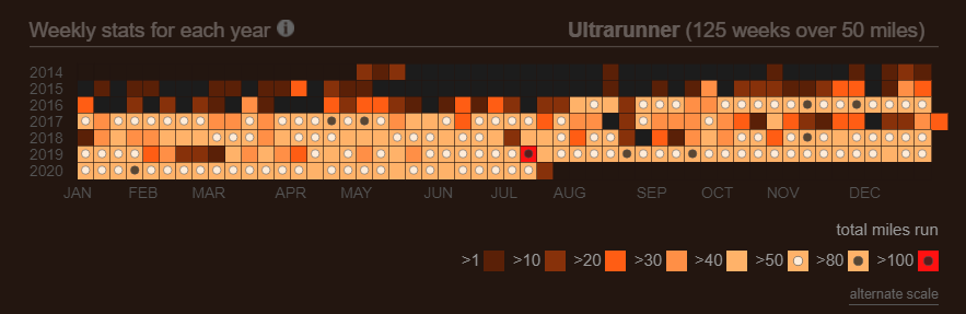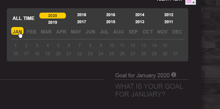
There’s a lot packed into that little calendar on the bottom of your overview page. The calendar heatmap with its 3 distinct views for all time, yearly, and monthly stats is kind of a sleeper. When you first start using Smashrun you might think “oh that looks kind of cool” but not give it too much attention, but then as time passes and you play around with it a bit more it starts to reveal itself.
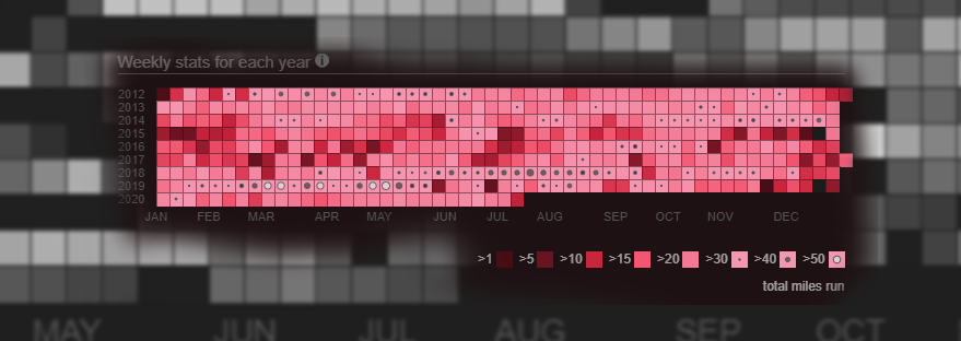
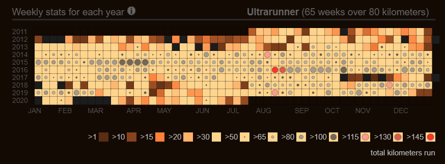
On the all time view, every single week you’ve ever run is there. You can scan vertically and see the seasonal changes over years of training. Or you can scan horizontally and see the buildup in training for different races at different times each year.
Or you can hover over the legend and know immediately how many weeks you’ve ever exceeded a certain training volume. But when it gets really cool is when you start moving your mouse over the scatter plot, and realize that you can instantly see which years and months you had your longest or and fastest runs.
But there’s always been this problem. The most important information was somewhat obscured. Sure, the marathons and the really high volume weeks stood out with their proud little black dots, but the whole gamut could get a bit lost in the noise. And this was doubly apparent to those with some type of color blindness.
The lead up to the NYC marathon in 2014, that twisted ankle from the cursed pair of sneakers, the oh, so nearly successful attempt at the Towering Staircase badge should have stood out in technicolor, but it didn’t, not really.
Well, we’ve done our absolute best to try and change that. First, we compressed the color range, so that if a high mileage week for you means breaking 10 miles [Chris: I have 104 such weeks] then you should still see a nice range of shades to discern the difference.
As your weekly volume passes 50km or 30 miles a dot appears (yes!), and that dot scales relative to your volume and then itself starts to change color, and then eventually shape creating a visual scale all the way up to 200km or 120 mile weeks.
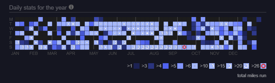
For the yearly view it gets more interesting. Since the blocks in this view represent daily volume or for the most part individual runs, it was an opportunity to create a visual language for the types of distance runs in structured training plans.
Runs under 10km are delineated by a color scale. Middle distance runs between 10 km and 15km (6 – 10miles) are shown as a dot that scale with the length of the run. Then runs from 15km to marathon length, are shown as a semicircle indicating the percent of the way to a complete marathon. A half marathon is thus a half circle, and a full marathon is a complete circle. The marathon gets a bright red hue chosen for the color of the rash across every contact surface on your body when you finish one.
The aim of all of this is to reduce the gap between seeing and understanding. At first you might need to reference the scale, but the hope is that pretty quickly when you review your training for previous races you should be able to just glance at it, and get it. That’s right, that year, I stacked two nearly marathon length runs into the week before the race, what was I thinking?! In a word, the hope is that this new view will deliver insight, but failing that, at the very least it’s nicer to look at.
UPDATE 7/14/2020
If you run weeks over 50 miles (80km) and prefer less information density you can now toggle to an alternate scale using the link below the legend. This alternate scale does not adjust the dot sizes by training volume, and uses only 2 dots one black and the other white. The cutoffs for the 2 dots are dynamically configured based on your individual training volume history.