The pandemic is at once a global and a local phenomenon. For the first time since the Second World War, nearly the entire population of the world is living through a shared experience of fear, grief and hope. We are all learning how to operate in a new reality, we are experiencing isolation, and we are learning how to live without things we once took for granted.
The experience worldwide is the same, but the degree and the timing is hugely varied. There is no single narrative. If you live in New Zealand the story of the virus is one of resilience and success, if you live in NYC it was the tale of a dark, terrifying and isolated winter followed by a spring awakening with each new day bringing better news. But if you live in Brazil or South Africa, then you’re in the midst of that dangerous Winter now.
Within the US, there’s thousands of diverging stories depending on the town or the city you live in. But the basic information that really matters for you, is how likely is it that someone you have had contact with has the virus, and how is that likelihood changing.
We built a coronavirus tracker that will hopefully make it easier for you to get that answer. It’s pretty straight forward to use, but there’s some important things to understand.
How the tool works
There are 3.5 main views.

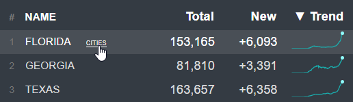
You can view trends and totals By Country, By US state, By US city, or by city within a US State (hence 0.5), by selecting a state and the clicking “cities”.
Sorting is powerful
Sort by name – This is useful for finding the place you’re interested in.
Sort by total – This answers where was the outbreak the worst historically
Sort by new – This helps answer how bad is the outbreak is now.
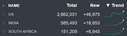
Sort by Trend – This shows where the outbreak is getting worse the quickest. (As of July 1 that’s the USA, followed by India and South Africa)
The data comes from Johns Hopkins
We track cases and deaths. The data is refreshed once a day and it comes directly from the John Hopkins data set. There are other interesting data sets like recovered cases, testing rates, and hospitalizations, but a lot of that data is incomplete or reported differently depending on the location, and that can be misleading.
An important toggle
You can adjust all of the data by population. This is really important because there’s a big difference between the roughly 240 new cases yesterday in NYC yesterday and the roughly 240 new cases in Glynn, Georgia. The experience of many smaller towns has been worse than large cities, and with fewer resources to respond.
Steps to understand your risk
The most important data point for you as an individual is the number of new cases each day per 1m population.
To find and bookmark this information for your location:
- Click on the top heading to select US State
- Click the name heading to Sort by Name
- Scroll down and select your State
- Click the word “cities” next to the name of your state
- Find your city or county and select it
- Select “Per 1m population” to toggle it on.
- Sort by “New”
- Bookmark the page for your location and return to it each week because things change fast.
If the number for your location is above 100 that means you’re in one of the highest risk places in the world. For reference, in NYC at the peak of the epidemic there were roughly 600 new cases per 1m people every day.
Watching out for a resurgence
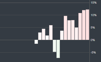
If you live somewhere where things are under control, then the most important number to track is the change in daily new cases on a rolling 7 day basis.
Reporting tends to follow a weekly pattern, it’s administrative, and so if fewer people are working, there are lower numbers reported. This doesn’t necessarily mean that cases are down. A rolling 7 day average helps correct for this.
You can see this data in the bottom chart. Right now for example Japan has very low case numbers, but those low case numbers are rising quickly, and if that keeps up there could be a big problem.
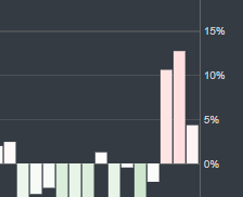
You can see the same thing happening in Connecticut. Although it’s ranked 41 out of 50 states by new cases, in the last 3 days the cases have suddenly jumped up. The numbers are still small, but the growth is the important thing to watch.
The good news for runners
What we didn’t know months ago, but we’re starting to understand now, is that the Coronavirus seems to spread in a very particular way. It’s transmitted by water droplets expelled during speech (laughs, coughs, sneezing and singing). This transmission happens most readily indoors, and also in low humidity.
If you’re outside running by yourself in the muggy weather, then the odds of transmitting or catching the virus would seem to be very low. If it’s breezy and humid, then the chances are even lower. Add if you add a mask to that equation and some social distancing, then you’ve reduced a small risk to almost nothing.
But what it turns out is actually really dangerous is being inside with the windows closed, with the A/C on (which lowers humidity dramatically) among a large number of people who are talking, laughing, shouting without wearing masks. Picture millions of tiny water droplets being expelled with each word, then hanging in the air with no breeze to blow them away and no humidity to block them, gently floating from one person to the next. That’s the scenario you want to avoid even in places that seem to have things under control.
Nice data to play with. One note: For the states, clicking on Cities is not cities (in most cases) it is by county.
Chris … that’s such nice work. Thank you.
Very nice job, very informative, Thank you!
Thank you. This is very helpful.
This is super useful, but it would be even better if you included China in the data table!