There’s a lot packed into that little calendar on the bottom of your overview page. The calendar heatmap with its 3 distinct views for all time, yearly, and monthly stats is kind of a sleeper. When you first start using Smashrun you might think “oh that looks kind of cool” but not give it too much attention, but then as time passes and you play around with it a bit more it starts to reveal itself.
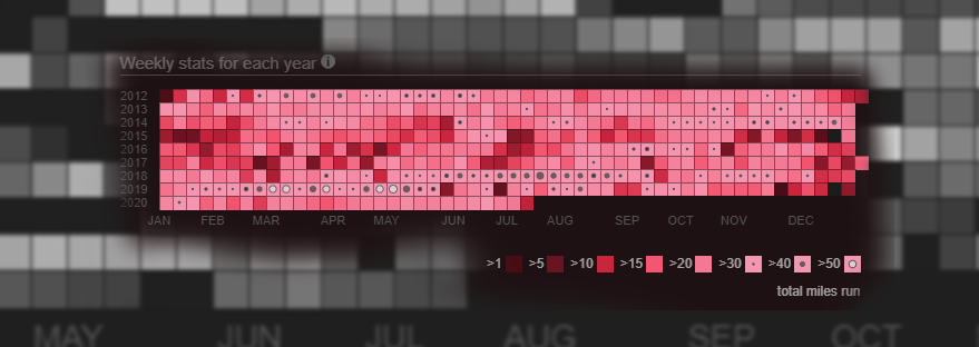
On the all time view, every single week you’ve ever run is there. You can scan vertically and see the seasonal changes over years of training. Or you can scan horizontally and see the buildup in training for different races at different times each year.
Or you can hover over the legend and know immediately how many weeks you’ve ever exceeded a certain training volume. But when it gets really cool is when you start moving your mouse over the scatter plot, and realize that you can instantly see which years and months you had your longest or and fastest runs.
But there’s always been this problem. The most important information was somewhat obscured. Sure, the marathons and the really high volume weeks stood out with their proud little black dots, but the whole gamut could get a bit lost in the noise. And this was doubly apparent to those with some type of color blindness.
The lead up to the NYC marathon in 2014, that twisted ankle from the cursed pair of sneakers, the oh, so nearly successful attempt at the Towering Staircase badge should have stood out in technicolor, but it didn’t, not really.
Well, we’ve done our absolute best to try and change that. First, we compressed the color range, so that if a high mileage week for you means breaking 10 miles [Chris: I have 104 such weeks] then you should still see a nice range of shades to discern the difference.
As your weekly volume passes 50km or 30 miles a dot appears (yes!), and that dot scales relative to your volume and then itself starts to change color, and then eventually shape creating a visual scale all the way up to 200km or 120 mile weeks.
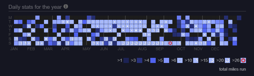
For the yearly view it gets more interesting. Since the blocks in this view represent daily volume or for the most part individual runs, it was an opportunity to create a visual language for the types of distance runs in structured training plans.
Runs under 10km are delineated by a color scale. Middle distance runs between 10 km and 15km (6 – 10miles) are shown as a dot that scale with the length of the run. Then runs from 15km to marathon length, are shown as a semicircle indicating the percent of the way to a complete marathon. A half marathon is thus a half circle, and a full marathon is a complete circle. The marathon gets a bright red hue chosen for the color of the rash across every contact surface on your body when you finish one.
The aim of all of this is to reduce the gap between seeing and understanding. At first you might need to reference the scale, but the hope is that pretty quickly when you review your training for previous races you should be able to just glance at it, and get it. That’s right, that year, I stacked two nearly marathon length runs into the week before the race, what was I thinking?! In a word, the hope is that this new view will deliver insight, but failing that, at the very least it’s nicer to look at.
UPDATE 7/14/2020
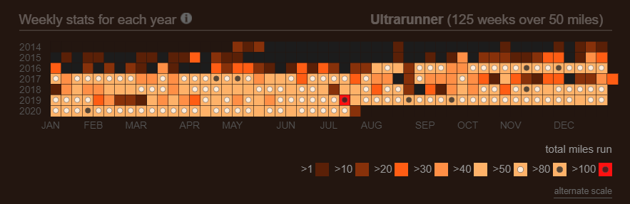
If you run weeks over 50 miles (80km) and prefer less information density you can now toggle to an alternate scale using the link below the legend. This alternate scale does not adjust the dot sizes by training volume, and uses only 2 dots one black and the other white. The cutoffs for the 2 dots are dynamically configured based on your individual training volume history.
Hi there, long time user here. I cannot help but share my feedback. While i appreciate anything that is helping to give me visual indicators of volume – in trying to build more transparency you introduced so much complexity that it is just headache-inducing.
My first suggestion would be to remove the coloring scheme related to our ” chosen color” completely. There is value in using the plain black and white to your advantage. I get that you are trying to tie it in to our overall color-schemes but it is really hard on the eyes.
My other main suggestion would be to maybe let people decide the increments they want to see? when some weeks over 100 having increments of 10 is just too many, it makes looking for the volume information i’m interested in very difficult to find. e.g all weeks above 50. If someone does lower volume regularly then i can see the current model working well for them, but a lot of folks on smashrun have a LOT of data they are looking at – and while I understand you are trying to add more depth, in the process it’s become difficult.
Thanks! Still love my smash <3
It’s definitely really challenging building a one size fits all solution to this problem. I’ve added an alternate scale that doesn’t change the size of the dots or their colors. It also has fewer increments, and sets the increments it does use by customizing it based on your individual data. Just click the link below the legend.
Thank you SO MUCH. This is seriously so much better. After i went to look, i saw that for me, with weeks between 0-100 i had 13 separate increments! This is <33333333333333333
Thank you!
I’m not seeing it (beta tester)
Hi John, the All Time view is a pretty subtle change for those with normal human volume like you and I. The hues are now a dynamic range rather than strict cutoffs, maybe a little prettier, and if you squint in theory you could tell that a 14 mile week is a lighter color than an 11 mile week. However, for the people running 50, 70, or even 120 mile weeks they can now visually distinguish between those. whereas before the scale used to just cut off.
The year view is a bit of a bigger change, breaking out short, middle distance, and long runs, for example a half-marathon is now a half circle a 20 mile run is now a 3/4 circle, and a marathon is a full circle.
Personally, I love the new look/functionality. Thanks!
Sorry mate, this is a real step back. My brain doesn’t interpret such minute color gradients and shape sizes quickly, and I have essentially lost the ability to quickly glance at my graph and see patterns.
Try out the alternate scale toggle just below the legend. I added it today, and updated the blog post.
Yup, that works for me, looks kind of cool 🙂
I like it. To be honest, I am one of those that plays with this only every once in a while. One thing I noticed just now, which I am sure was per design but raises a question, is when in all-time mode, when one hovers on a week, the scatter plot of pace/distance shows the average pace/run length for that week. However, if you hover over a week where you had no runs, the average dot moves to your overall, all-time average. Seems it should move to 0 for average pace or average miles for that week.
Interesting that this is a regression for some people. I like it a lot and can see patterns more clearly and faster then before.
I love this!
Very nice improvement. I only use it rarely but the changes make it much more appealing and great to see the progression, and the opposite in training so much more easily. Thanks!
Before, the scale went from a dark hue of the chosen color to white (at least it looked white to me), before the dots were added. For example, it reached white at 50k in the all-time view for me, the dot was added at 65k. Now, it the scale only goes to a light hue of my chosen color, and the new dot is added earlier. I now have a small dot at 50k, and a slightly larger dot at 65k.
While I think the dots are a good visual indication, the color is an even better one. So, I would suggest to extend the distinction by color again, and start the distinction by dot later.
Love that you folks are thinking about these things and trying to make Smashrun even better!
I’m a big fan of this, but it seems like some of mine are a little messed up. I have a couple weeks with exactly 20.00 miles, and theyre only marked as 15mi+
This so works for me; I don’t know if its my choice of colours, or what, but it seems really clear how I’m doing (how I was doing).
The red circles are standout (ha,ha). No really, I like them.
Keep these good things coming.
This is a great improvement, thanks!
I really like this update – the year view in particular is really insightful.
Sorry but I don’t like it. I loved the calendar before and found it quite motivating, now it’s just not very clear at all compared to before and for me lost its function.
For example look at these 5 weeks in my calendar: https://imgur.com/a/AzbU2Fj
I think the second dot is larger than the first but I’m not entirely sure, nor can I tell which size is which distance. This is with 160% zoom active btw so zooming doesn’t help much.
This is with the alternate scale which is better than the standard scale but still not nearly as clear as it looked orignally.
I appreciate that the Smashrun team tries to make improvements to the service. In this case though, I really miss the old scale. For me, my little square would turn white when I ran weeks over 30 mpw. I loved working hard to win those white squares that stuck out so plainly on my graph. I would even make sure I went out to run 1-2 miles on a Sunday if I was just a little short, all so I could have that nice color. Now, I have no idea what I’m looking at – just looks like a mass of one color with very little differentiation.
So, it used to be a hard cut off. 30 miles was one color and 20 miles was a different color. Now it’s a gradient 29 miles is very similar to 30 except for the small dot. In some ways this makes sense because 29 is close to 30, but in other ways I can see why it’s not as satisfying. By breaking 30 you used to be awarded a new color. Now it’s a gradual change.
If you haven’t tried already, you should experiment with different color choices. The visualization can look very different with lighter vs darker base colors. You might also try selecting “alternate scale” just below the calendar.
The calendar update was great, I really appreciate the work you all put into this site.
I’m running into one limitation now:
“Data older than 10 years is stored, but can not be viewed at this time due to technical limitations.”
Any plans on expanding the data display beyond 10 years? I love having all the data in one place.
It’s high on the list. Jacklyn and I have old data we’d love to see too. 🙂
A friend sent me a screenshot of one of these calendar heatmaps after I shared a blog post where I discuss building something similar. I was happy to find this post discussing the data viz and the reasons you gave for the design decisions, which mostly relate to dealing with edge cases, or outliers in the data. I came across the same issue (my heatmap was only plotting daily walks, but I had the same problem)
I love the aesthetic of your visualization, and I’m impressed you built it in CSS/HTML. I don’t know if I could have done it without using Mike Bostock’s SVG/D3 example as a starting point.
https://d3og.com/mbostock/4063318/