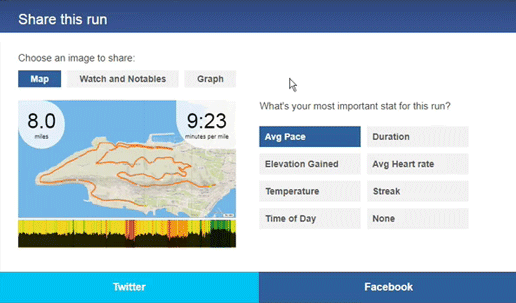
We’ve improved sharing on Smashrun! Now you can choose between three different images to share on Facebook or Twitter, and highlight the information that matters most for that run.
Runs with GPS
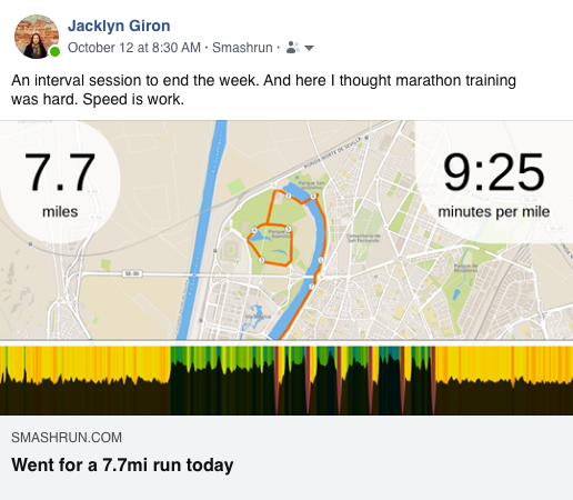
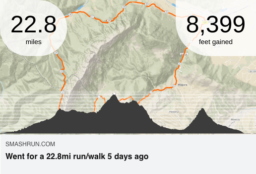
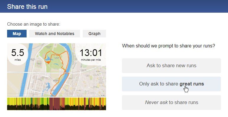
Take advantage of the Smashrun Pro map and share a more detailed visualization of your running route. Choose to display your pace graph, elevation profile, or HR data depending on the type of run.
For example, intervals tend to look better when visualized by pace.
Whereas, trail runs are often better viewed with an elevation profile.
Footpod runs
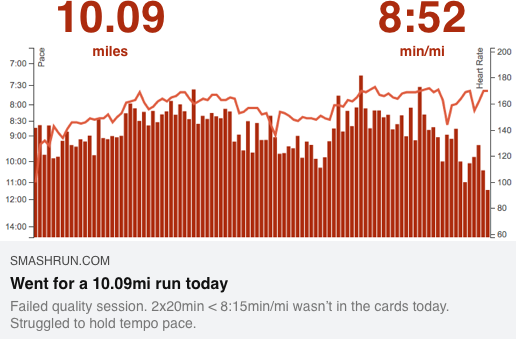
Similar to our original format for shared runs, activities that only contain pace data and lack GPS can be shared as pace graphs including the HR, if available. You can also choose to share GPS runs this way, if you don’t want to publicly post your map.
Manual entries or treadmill runs
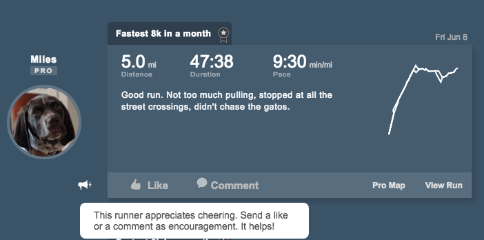
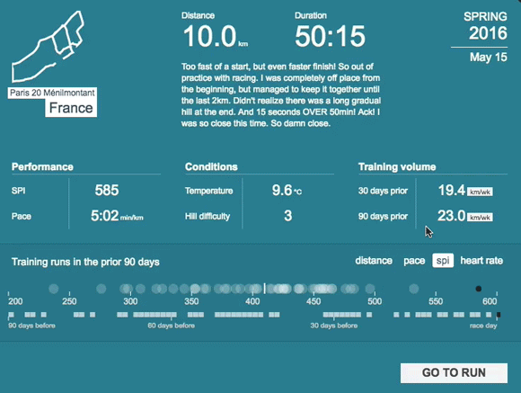
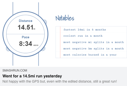
And if you happened to run indoors or don’t want to share your route/pace graph, due to bad GPS, you can also share a watch face with two data fields including the run’s notables. And if there are more than 5 notables, we’ll take the top 5 🙂
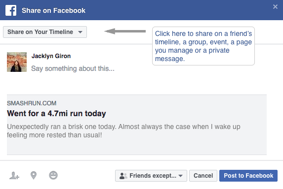
Your privacy settings will still apply to how you share your runs. And you can share the same run in different ways depending on what you want to post on Facebook or Twitter. Currently, the Facebook sharing option will now also allow you to post a run to a group instead of just your timeline. Win!
From the share modal, you can also control how you want to be prompted to share your runs. You can choose to be prompted after each new run, after only particularly good runs, or to never be prompted at all.
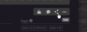
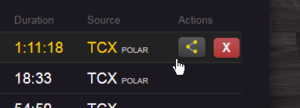
Regardless of which option you choose you can always manually share a run by clicking on the share icon from your “By run” or “Run list” page.
Questions about sharing? Leave us a comment or send us an email at hi@smashrun.com.
Now go share some great runs!