The Polar historical data importer broke last month. We need to make some sizable changes on our side to remedy the issue and it’s taking longer than anticipated. That said, if you only need to import new runs you can still connect to Polar (autosync) from your Settings Sync Page. This connection will automatically push your new runs directly to Smashrun shortly after they’re available on Polar Flow. While this won’t solve everyone’s use case, for many of you this should be a convenient and easy to implement option.
Strava Integration
We’ve made some adjustments to the import to capture race and treadmill flags and tag the runs as appropriate. We’ve also changed to combine the Strava activity title and description in the Smashrun description field. We heard from some user’s who made a case for this, but if it’s not working out for you just reach out with your ideas, and maybe we can find a better way to do it.
Coros Integration
We identified a bug that was affecting some users which prevented runs from flowing through automatically. This was patched this morning and should put the issue to bed.
Holiday sale
You still have a few days to take advantage of the Smashrun BOGO holiday sale. You can pickup a matching subscription for any new Smashrun Pro user by signing up for Pro or even by renewing early.
A baby girl
After working on Smashrun together for almost a decade, Jacklyn and I had a baby girl a couple of weeks ago. If we’ve both been a bit slow responding to emails lately, I know that you will understand. Thanks so much for your support over the years that’s allowed us to keep our dreams alive.
It’s that time of year. The Winter Solstice is coming up soon, and if you time your runs correctly there’s a badge in it for you. To earn “The Shortest Day” you’ll need to complete two runs on the day of the solstice. The first needs to start before sunrise and finish after and the second needs to start before sunset and finish after it goes beneath the horizon.
Running can run the gamut between being a complete drudge, and a truly spiritual experience. This run will almost certainly be one of the two. You’ll be strapping on your kicks, and going out in the dark and also, possibly, the bitter cold. While you wait for your GPS to sync you may think to yourself “This is it. The earth has moved as far as it can go in one direction and from tomorrow it will start to come back. This day has signified the cycle of death and rebirth among human cultures across the globe since time immemorial” or you may think “I can’t feel my toes.” You just don’t know how it will go until you give it a try.
The Solstice Badge is a chance to roll the dice, to take a chance on something truly meaningful, to feel your heart beat in your chest, to see your breath explode into the air, to watch the sun crest the horizon, and then later to watch it fall beneath the earth. Set your alarm! Take the chance!
Here are some important things to remember:
The solstice happens at the same moment across the globe, but it will happen in very different time zones. This year in most places in the world it will occur on Tuesday, December 21st. Confirm the date and sunrise, sunset times with Google.
Treadmill runs don’t count. Treadmills are cold machinations isolating you from the natural glory of your local suburban through road. Also, we need GPS to figure out the time of the sunrise and sunset.
Give yourself enough time. You need to get dressed, get out the door and get GPS before the sun crests the horizon. You can count on the fact that GPS will take longer to sync when you’re shivering in the predawn cold. It’s best to start a bit before sunrise, and finish a little while after.
If you’re south of the equator. Then this will be your Summer Solstice. The day will be long, it will probably pretty warm, and your badge will blue and orange.
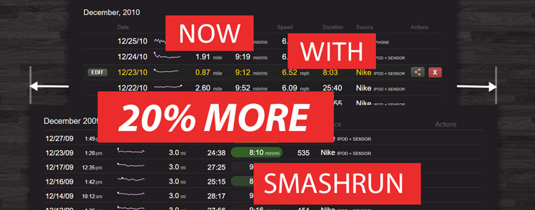
Smashrun now displays more than 10 years of data. We had to make a few changes under the hood to make this possible. But one of the most visible was the need for more pixels to display all of that data. So, Smashrun needed to get a wee bit wider.
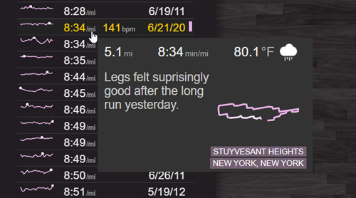
All these new pixels allowed some room for a few more data points. Pro users can now see elevation and heart rate on the Run list page, as well as seeing heart rate on the By Run page’s “fastest run for distance” list.
If you’ve got a very, long running history on Smashrun, then your All Time view may now seem a bit cluttered. The easiest fix for that is to set a “Hide runs before date” on your Settings – > Profile page. It’s relatively easy to flip on and off, and setting it can help you focus on your more recent training without getting too fixated on those PR’s that you set when you were a lot younger
A new quick view
If you hover over one of your fastest runs for a distance you’ll now see a quick view with the description of your run, a map, and some additional stats. This can make it easier to get some clarity on these runs without having to drill down to each one.
New integrations
We’ve added support for Adidas Running (AKA Runtastic). You can create a connection on your settings sync page. Adidas, has a pretty nice app for both Android and iPhone.
We’re working on adding support for Coros watches. We’ll start beta testing in the coming weeks, so shoot an email to hi@smashrun.com if you’re interested.
There’s also a new Google Play app called Health Sync which can sync from a variety of sources to Smashrun including some infrequently supported sources like Huawei Health and Samsung Health.
Odds and ends
You can now see the cut offs for speed ranks with distances you’ve never run. The friends panel also got a slight design tweak. And on the run list page we set it up, so that if you click on a heading it’ll highlight the highest values for that field.
(The mobile site is still limited to 10 years of data. We’ll address that in a future release)
Under Garmin (auto-sync) if you you see a “Connect” button click it. This will open a popup. If it doesn’t it might be blocked by your browser. (Look for an unfamiliar icon in the browser url bar, and click it to enable popups). Login to Garmin Connect and follow the prompts.
The popup should disappear and you’ll see a message “Connecting to Garmin”
There’s about a 1 in 10 chance you’ll get a message saying “Garmin’s being weird”. We’re working on this, but the fix is easy, just try again.
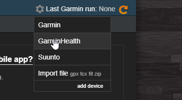
The next step is important. If you’re on a desktop, mouse over the gear and change the default import source to GarminHealth and then click the sync icon. If you’re on a phone click the hamburger menu on the right side and select “Sync GarminHealth”
If you’ve done this, and your runs still aren’t showing up it may be because of a limitation of the new Garmin API:
The new API will only sync runs that originated from a Garmin watch. Garmin will not send runs from other sources to us, even if they’re on Garmin Connect.
The run must be classified as a run on your watch. If you record it as another activity type and then change it to running on Garmin Connect, Garmin will not send it to us.
New runs will be pushed automatically. You should not need to click sync unless you’re retrieving older runs that are missing on Smashrun.
The new API is fire and forget. We ask Garmin for runs, and it gets back to us. We have no way of knowing how long it will take or if it will respond at all.
We’ve currently capped historical sync at April 11th because we are having issues with duplicates, missing runs, and multisport/triathlon runs. When we work out these issues we’ll enable full historical sync.
The old sync was much better at importing historical data. If you are having trouble importing data please do not delete your account and create a new account.
If you have missing runs, remember you can always import the FIT files from Garmin Connect.
To do this:
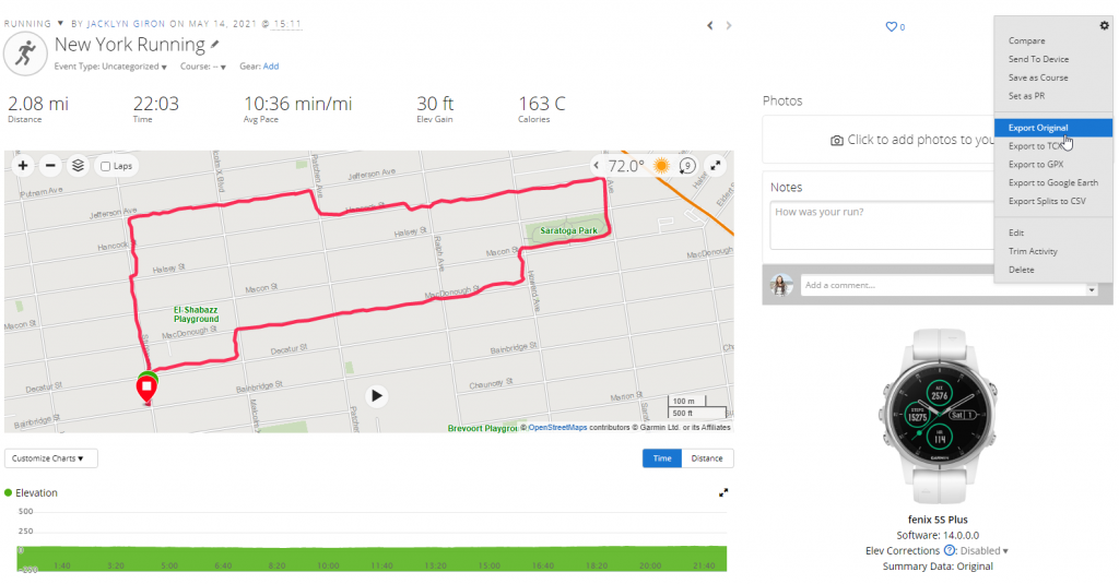
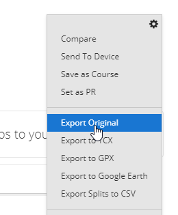
View the activity on Garmin Connect and mouse over the gear on the right hand side.
Export original source
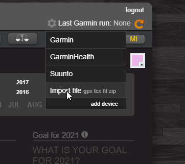
Import the file into Smashrun
I know for some of you this transition has been really frustrating, things were working well, and now they’re not. We’re committed to working through all the issues, we’re just a bit overwhelmed, so it may take some time. Don’t give up. We’ll address every issue to the full extent that we’re capable.
The data we’re receiving from Garmin’s API is currently experiencing delays of between 30mins to 12 hours. If you’re connected to Garmin you’ll likely see summary data only, while we wait for Garmin to send the detailed information.
I know this is frustrating, and I’m sorry for the inconvenience. We’ve reached out to Garmin and are awaiting a resolution.
If you currently import from Garmin take a second right now and go to your Settings Sync Page and connect your account to the new Garmin API.
This new Garmin API is replacing our existing API connection starting today, so please make sure you connect.
Once you’re connected your next run will automatically sync to Smashrun as soon as it arrives on Garmin Connect. That means no more need to click the sync button. (If you’re a Pro user once you move to the new API everything should be the same as it was.)
For the moment historical synchronization from the Garmin API will be disabled. If you’re an existing user, this shouldn’t make a difference at all. If you’re a new user then check back next week after we work out all the bugs with historical import (or use a 3rd party site like Fitness Syncer).
UPDATE 4/8/21
We had a deadline from Garmin to switch to this new API, so unfortunately these changes had to go live for everyone before we had done the usual beta testing. We’re continuously releasing patches, so please report any issues you spot and we’ll keep knocking away at them.
Tonight we released a major rewrite of our import architecture in preparation for migrating to the Garmin Health API.
Smashrun has integrations for a lot of different sources, and then there’s our API, and FIT/TCX/GPX file import, and of course import via email. And it’s all inextricably intertwined. We’ve done a lot of testing over the past week, but there’s a lot of moving parts, and we updated a *lot* of lines of code, and well….it’s been a long night, and it’s not entirely impossible that we broke something.
If all goes well then everything should work exactly the same as it always has. However, if you happen to notice any unexpected behavior, anything weird or out of place, please shoot us an email at hi@smashrun.com and we’ll sort it out.
There’s a lot packed into that little calendar on the bottom of your overview page. The calendar heatmap with its 3 distinct views for all time, yearly, and monthly stats is kind of a sleeper. When you first start using Smashrun you might think “oh that looks kind of cool” but not give it too much attention, but then as time passes and you play around with it a bit more it starts to reveal itself.
On the all time view, every single week you’ve ever run is there. You can scan vertically and see the seasonal changes over years of training. Or you can scan horizontally and see the buildup in training for different races at different times each year.
Or you can hover over the legend and know immediately how many weeks you’ve ever exceeded a certain training volume. But when it gets really cool is when you start moving your mouse over the scatter plot, and realize that you can instantly see which years and months you had your longest or and fastest runs.
But there’s always been this problem. The most important information was somewhat obscured. Sure, the marathons and the really high volume weeks stood out with their proud little black dots, but the whole gamut could get a bit lost in the noise. And this was doubly apparent to those with some type of color blindness.
The lead up to the NYC marathon in 2014, that twisted ankle from the cursed pair of sneakers, the oh, so nearly successful attempt at the Towering Staircase badge should have stood out in technicolor, but it didn’t, not really.
Well, we’ve done our absolute best to try and change that. First, we compressed the color range, so that if a high mileage week for you means breaking 10 miles [Chris: I have 104 such weeks] then you should still see a nice range of shades to discern the difference.
As your weekly volume passes 50km or 30 miles a dot appears (yes!), and that dot scales relative to your volume and then itself starts to change color, and then eventually shape creating a visual scale all the way up to 200km or 120 mile weeks.
For the yearly view it gets more interesting. Since the blocks in this view represent daily volume or for the most part individual runs, it was an opportunity to create a visual language for the types of distance runs in structured training plans.
Runs under 10km are delineated by a color scale. Middle distance runs between 10 km and 15km (6 – 10miles) are shown as a dot that scale with the length of the run. Then runs from 15km to marathon length, are shown as a semicircle indicating the percent of the way to a complete marathon. A half marathon is thus a half circle, and a full marathon is a complete circle. The marathon gets a bright red hue chosen for the color of the rash across every contact surface on your body when you finish one.
The aim of all of this is to reduce the gap between seeing and understanding. At first you might need to reference the scale, but the hope is that pretty quickly when you review your training for previous races you should be able to just glance at it, and get it. That’s right, that year, I stacked two nearly marathon length runs into the week before the race, what was I thinking?! In a word, the hope is that this new view will deliver insight, but failing that, at the very least it’s nicer to look at.
UPDATE 7/14/2020
If you run weeks over 50 miles (80km) and prefer less information density you can now toggle to an alternate scale using the link below the legend. This alternate scale does not adjust the dot sizes by training volume, and uses only 2 dots one black and the other white. The cutoffs for the 2 dots are dynamically configured based on your individual training volume history.
The pandemic is at once a global and a local phenomenon. For the first time since the Second World War, nearly the entire population of the world is living through a shared experience of fear, grief and hope. We are all learning how to operate in a new reality, we are experiencing isolation, and we are learning how to live without things we once took for granted.
The experience worldwide is the same, but the degree and the timing is hugely varied. There is no single narrative. If you live in New Zealand the story of the virus is one of resilience and success, if you live in NYC it was the tale of a dark, terrifying and isolated winter followed by a spring awakening with each new day bringing better news. But if you live in Brazil or South Africa, then you’re in the midst of that dangerous Winter now.
Within the US, there’s thousands of diverging stories depending on the town or the city you live in. But the basic information that really matters for you, is how likely is it that someone you have had contact with has the virus, and how is that likelihood changing.
We built a coronavirus tracker that will hopefully make it easier for you to get that answer. It’s pretty straight forward to use, but there’s some important things to understand.
How the tool works
There are 3.5 main views.
You can view trends and totals By Country, By US state, By US city, or by city within a US State (hence 0.5), by selecting a state and the clicking “cities”.
Sorting is powerful
Sort by name – This is useful for finding the place you’re interested in.
Sort by total – This answers where was the outbreak the worst historically
Sort by new – This helps answer how bad is the outbreak is now.
Sort by Trend – This shows where the outbreak is getting worse the quickest. (As of July 1 that’s the USA, followed by India and South Africa)
The data comes from Johns Hopkins
We track cases and deaths. The data is refreshed once a day and it comes directly from the John Hopkins data set. There are other interesting data sets like recovered cases, testing rates, and hospitalizations, but a lot of that data is incomplete or reported differently depending on the location, and that can be misleading.
An important toggle
You can adjust all of the data by population. This is really important because there’s a big difference between the roughly 240 new cases yesterday in NYC yesterday and the roughly 240 new cases in Glynn, Georgia. The experience of many smaller towns has been worse than large cities, and with fewer resources to respond.
Steps to understand your risk
The most important data point for you as an individual is the number of new cases each day per 1m population.
To find and bookmark this information for your location:
Click on the top heading to select US State
Click the name heading to Sort by Name
Scroll down and select your State
Click the word “cities” next to the name of your state
Find your city or county and select it
Select “Per 1m population” to toggle it on.
Sort by “New”
Bookmark the page for your location and return to it each week because things change fast.
If the number for your location is above 100 that means you’re in one of the highest risk places in the world. For reference, in NYC at the peak of the epidemic there were roughly 600 new cases per 1m people every day.
Watching out for a resurgence
If you live somewhere where things are under control, then the most important number to track is the change in daily new cases on a rolling 7 day basis.
Reporting tends to follow a weekly pattern, it’s administrative, and so if fewer people are working, there are lower numbers reported. This doesn’t necessarily mean that cases are down. A rolling 7 day average helps correct for this.
You can see this data in the bottom chart. Right now for example Japan has very low case numbers, but those low case numbers are rising quickly, and if that keeps up there could be a big problem.
You can see the same thing happening in Connecticut. Although it’s ranked 41 out of 50 states by new cases, in the last 3 days the cases have suddenly jumped up. The numbers are still small, but the growth is the important thing to watch.
The good news for runners
What we didn’t know months ago, but we’re starting to understand now, is that the Coronavirus seems to spread in a very particular way. It’s transmitted by water droplets expelled during speech (laughs, coughs, sneezing and singing). This transmission happens most readily indoors, and also in low humidity.
If you’re outside running by yourself in the muggy weather, then the odds of transmitting or catching the virus would seem to be very low. If it’s breezy and humid, then the chances are even lower. Add if you add a mask to that equation and some social distancing, then you’ve reduced a small risk to almost nothing.
But what it turns out is actually really dangerous is being inside with the windows closed, with the A/C on (which lowers humidity dramatically) among a large number of people who are talking, laughing, shouting without wearing masks. Picture millions of tiny water droplets being expelled with each word, then hanging in the air with no breeze to blow them away and no humidity to block them, gently floating from one person to the next. That’s the scenario you want to avoid even in places that seem to have things under control.
For some, running is a solitary experience, a chance to be by yourself, to collect your thoughts alone and be lost in nature. But for many of us, it’s something very different – running through city streets and crowded thoroughfares, passing through throngs of people.
And so now, we each have a choice to make. Suddenly we’re responsible not just for our own health, but the health of our loved ones and the health of our community. How much risk are we taking? And how can we mitigate those risks?
For those running streaks, the choice can be much harder. A streak is something you’ve invested in. Many runners haven’t missed a day this year, but others are on multi-year streaks. These streaks are a real accomplishment, they represent hundreds of hard choices where you put your health first when you really didn’t feel like running. But now, suddenly, that math has changed.
We can take less busy routes. We can cross the street. We can wear a mask. We can head straight to the shower when we’re done. But at the end of the day, each run represents a non-zero risk not just to ourselves but to others.
Being human means taking on and managing risk. We weigh the variables and we make informed choices. Sometimes we’ve run by motorways, or down icy trails, or pushed our body and heart to the limit to hit a PR. But those choices were different. They were personal choices.
And sometimes, and I don’t say this lightly….sometimes, the trappings that go along with those choices can really make things complicated. Trappings like streak numbers, goals you’ve set for yourself, and super-awesome-and-rare badges.
So, I have a proposition. If one day, you go to leave for your daily run, and you think “I’m not really sure this is a good idea.” Just do this: *Skip the run* Give yourself a pass. Sure, you ran through rain and snow. You ran on hot days and freezing ones. You ran for a dozen days in a row, you ran for a hundred or even a thousand. But, today, you didn’t run because it wasn’t the right thing to do. And that’s a good thing.
If you decide to make that choice, we’ll sort out the badges and even the streak counters. There’s a global pandemic. You get a pass. Email us, and we’ll figure it out. We’re not sure how we’ll implement it just yet. But even if it means writing code for specific for individual users we’ll do what’s needed, just email us and let us know.
Get a new perspective on your running with Smashrun. Quick set up, easy to use, and it’s free!