We’ve added a new visual layer to Smashrun’s Overview pages! Now you can interact with the distance charts, Trailing mileage charts, Runs distance vs. pace, and an infinitely more useful version of Days run vs. days without.
The interactivity should provide more transparency to your data so you can actually dig in and discover additional metrics such as number of runs, average pace in different time periods, % of runs above a certain distance or pace, without ever having to leave your Overview page. Here’s the detailed rundown.
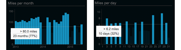
Miles/kilometers per month/day
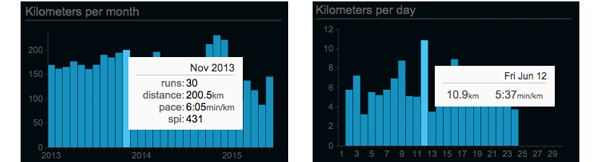
Mouse over any of the bars within Miles/Kilometers per month to see number of runs, total distance, and average pace. Average SPI will also show up for Smashrun Pro users. If you click on a given month, it will take you to that month’s overview page. Likewise, if you’re on the month view and you click on a day, it will take you to the run.
In addition, you can also mouse over the values along the y-axis, to see which percentage of your runs (or which months/days) are greater than a certain distance. This allows you to get a better sense of your base mileage – plus, it’s kind of interesting to see how much of your monthly volume or daily runs are above or below a certain distance!
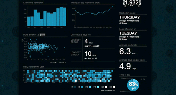
Trailing mileage charts
This has always been a bit tricky to explain. Because it’s “trailing”, any given point along a trailing mileage chart is the cumulative result of a preceding period. In other words, it’s a rolling total distance.
Any point within the All Time view will show the period of one year, points within the yearly view will show the trailing 90-day period, and points within the monthly view will show the trailing 7-days.
Now that you can interact with the trailing mileage charts, you can actually see which months/days contributed to any point within the chart. You’ll also see which runs are included on the Miles/km per month, Runs distance vs. pace, and the daily/weekly stats calendar.
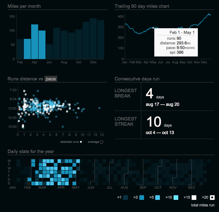
Runs distance vs. pace/SPI
Runs distance vs. pace chart (the scatterplot) now shows the % of runs faster than a certain pace and/or greater than a certain distance. This will give you a much clearer understanding of your run distribution. You can now also select a run from within the scatterplot and it will take you to the By Run page.
Move your cursor over the y-axis values to see what percentage of runs are faster than a certain pace. Mouse over the x-axis values to see what percentage of runs are longer than a certain distance. To see runs greater than a certain distance and pace, move your cursor within the scatterplot.
For Smashrun Pro users, you can switch the scatterplot to display Runs distance vs. SPI. This will help you compare your runs based on performance instead of average pace.
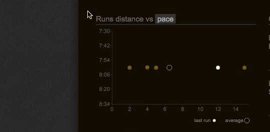
So if, for instance, you wanted a quick and easy way to spot your 10 best runs this month (or top 10 runs for the year or even all time!), now you can. And you can click on the run within the scatterplot to view its By Run page.
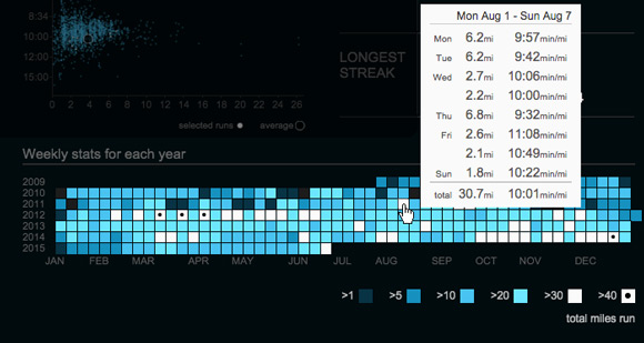
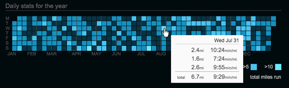
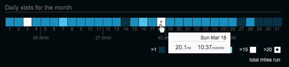
Weekly and Daily stats for the year/month
We replaced Days run vs. days without with a calendar heat map that visualizes your weekly and daily training volume. The colors will help you distinguish between the high and low volume weeks or days, which can be really useful when you’re reviewing your training history and you want to figure out in which weeks or days you ran the most. All you have to do is mouse over the distance brackets.
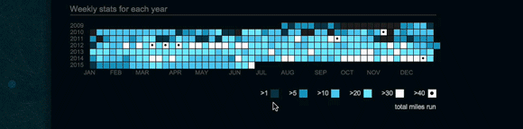
In the All Time view, it shows your weekly stats for each year. From this, you can see in which years you might have been training for an event like a marathon, because you’ll spot the high mileage weeks in white.
In the yearly view, you’ll see your daily stats for the year. Each day of the week has its own row. Because of this, you can answer questions like: on which days do I run the least distance or when do I usually run long?
In the monthly view, it’ll be the daily stats for the month, which includes the total distance for each week (just after every Sunday).
There were many breaking changes in this release, so please keep us posted and send us an email at hi@smashrun.com if you encounter any issues.
Other big changes…
- Importer – if you’re importing multiple runs for the same day (e.g. if you ran twice today), both runs will get imported at the same time whereas before every run entered the main import queue
- Prompt to publish – if your FB post preference is set to “prompt to publish” and you just imported multiple runs, the prompt will always default to the longest run that you just imported instead of the last run that was imported
- Same logic above applies to auto-publish
- iSmoothRun/Run.GPS users, and anyone importing via email: you should now get prompt to publish and post-import notifications
- Import via email – the “you’ve got mail” notification now only shows up once when bulk importing > 20 runs, otherwise you’ll just get the “we successfully imported your run” modal
- Multi-sport – you can now retrieve the run portion(s) of a multi-sport activity from Garmin Connect (yeah!)
We also recently updated the running apps page to reflect recent testing with Android apps and Windows Phone apps, and, in case you missed our last post, Smashrun is now integrated with RunGap (which can help you retrieve your stats from Strava and Suunto, among many others, and into Smashrun).
This is really useful. Thanks. I just need Polar Flow integration and I’ll be in heaven!
Nice additions guys!
One thing i’ve found though is that when i sync with Garmin the page no longer auto-reloads (thus showing the new run). Is this deliberate? It’s a bit annoying to have to manually reload the page after i’ve already hit sync. Started doing this a few months ago.
This happens on OSX 10.9 in Safari, Chrome, Firefox, and in my iOS browser (iPhone 6).
That definitely shouldn’t happen. If it’s been happening for months, I’m guessing it’s account specific, or maybe an adblocker issue? We do a lot of testing with Garmin sync, and the post run notification was rewritten for today’s release. If you send an email with your username to hi@smashrun, I’m sure I can get to the bottom of it.
Thanks Chris. It might be an ad blocker, although i’ve always used one (something updated maybe?). I’ll email.
BTW, I just signed up as pro for a second year. The site is great and really useful to track everything from individual runs to long term progress. Love what you guys have created! Keep it coming!
[…] Tous les détails sont ici. […]
Great visualization tool ! Thanks a lot for this innovations !
I made a short blog post in french about this update : http://www.nfkb0.com/2015/06/28/chouette-mise-a-jour-chez-smashrun-com/
Thanks for the post! It was a challenge, and we’ve been excited/worried to see how the changes will be received.
great additions. Love the website.
With multi sport uploads they website hasn’t uploaded historical files (I did a tri 7th March) which doesn’t show.
Any ideas? Probably me being stupid.
Hi Andrew! You’ll need to set a minimum import date to the date of your oldest multi-sport run on Garmin. If your tri was on March 7, 2015 – I’d go to https://secure.smashrun.com/settings-sync and set the minimum import date for Garmin to March 7, 2015 > then sync.
That is *fantastic*. The graphs used to be awesome. Now they’re amazingly omg awesome!
Seriously Awesome. Job Well Done!
I’ve been wishing I could see month over month easier, this is perfect. I love the heatmaps and the breakdowns… it all moves so seamlessly. Seriously, you guys rock. This is perfect. Smashrun is now my single home for my running data.
Awesome.
Fantastic update! Great works making everything more interactive… I’ll be spending even more time at SmashRun than I already do.
I’m seeing a couple very minor bugs:
-On the Daily Stats for the Month graph, the weekly mileage totals that display along the bottom are showing the wrong unit. The actual numbers are correctly in miles, but the unit is km.
-On the yearly and monthly daily stats graph, the furthest right mileage color does not display the tooltip with run stats for that range when I hover over. The interactive graphs above isolate correctly, but I don’t get the pop-up for runs, distance, and average pace. The far right color on the All-Time page does work, popping up my weeks with >20 miles in the Weekly Stats for Each Year Graph.
-This may be unrelated to the update, but I remember it working right before: on the distance ranks page, the interactive percentile graph is giving me values in km. Again, it looks like the actual numbers are in miles, so it may be related to the issue with the Daily Stats for the Month graph.
Again, these are super-minor nitpicks, and I’m sure you’re all still hard at work squashing bugs. Just a couple things I happened to come across in case you hadn’t caught them yet. Great work on the update!
Update to the above: on the yearly and monthly stats graphs, the furthest right mileage bucket actually only isolates data in that graph for me. It doesn’t update the Distance vs pace or mileage per day/month graphs like the other mileage buckets do.
Thanks for the detailed report (and for the clarification on the daily stats)! We’ll make sure they’re squashed asap.
Awesome! And that screenshot is on the way.
For the interactive distance percentile graph, do you think you could send me a screenshot at jacklyn[at]smashrun? I’m only seeing distance in miles when my unit is set to miles. I also tried visiting a user’s distance rank who has his default unit set to km and it still defaults to my selected unit (in miles).
Just pushed out a patch. The first 2 issues you found should be fixed. We haven’t been able to replicate the ranks issue yet.
Thanks for pushing out the fixes so quickly, looks great!
Just an FYI on the ranks issue, I noticed the same thing happening this morning on my graphs for the speed ranks as well. But just like with distance, all the calculations appear to be correct. I can send additional screenshots if needed.
Not sure if you pushed out any more updates, but the ranks issue appears to be fixed for me!
Just wanted to say that this is a wonderful update. Really useful and interesting to see how everything breaks down. Keep up the great work!
Can we get the same publishing ability for Twitter as you have for Facebook?
[…] An important part of successful race preparation is understanding what worked in the past, what didn’t, and what can be improved. A great way to do that is to use the Analyze Run View to learn from specific races, in combination with your stats dashboard. […]