Before we designed the Pro Map, we asked ourselves: what sort of information is best conveyed while viewing the route of your run?
There’s the obvious metrics including your fastest split, the ability to see elevation changes and, a pace graph that you can interact with. All of these are helpful in the sense that they summarize exactly what you did. You know how fast you ran, how far, your average HR, cadence, etc. but, you don’t always know what contributed to your performance.
The Pro Map is designed to help you better understand the relationships between the different variables that affect your running. By looking at these relationships, you can identify your strengths and weakness for a given route. Here are some of the things I look at on a day-to-day basis after a run.
How Hill Grade Affects Speed
Chances are pretty good that you’ll slow down while running uphill and speed up on the downhill, whereas what you should do is maintain the same effort and stick as close as possible to your target pace as you go up and down the hill.
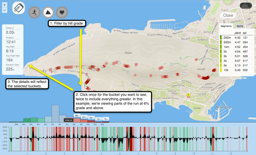
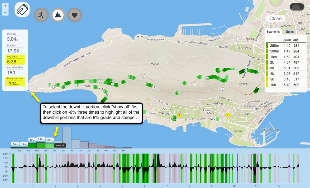
If you wanted to compare your speed for running uphill vs. downhill, you just have to look at your hill grade distribution, highlight the relevant %grade, and view the revised details on the left.
This is what it looks like when you select all of the uphill portions, 6% grade and higher, for a run.

To compare it to your downhill stats, just select the opposite side of the distribution curve – select the buckets that are -6% grade and lower.

You could also mouse over the pace filter while viewing your hill distribution to see how your pace changed at specific points during a run.
HR Recovery Between Intervals
Intervals, or repeats, are most effective when they’re executed consistently after every recovery. If, however, each interval goes slower than your last then you’re probably either overreaching or you need a much longer recovery period between each repeat.
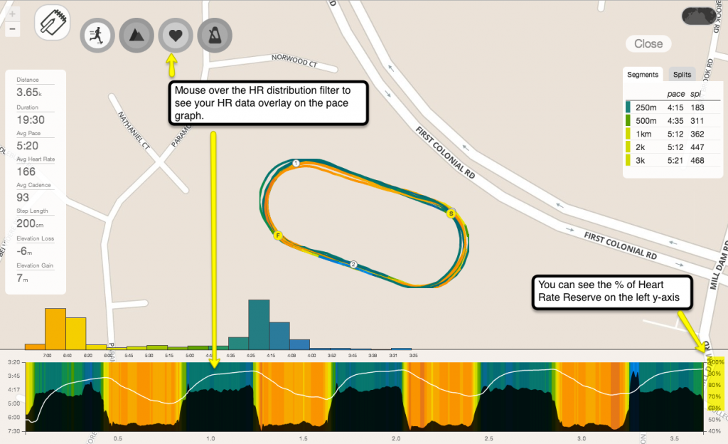
HR is one of the best indicators of recovery. When your HR isn’t recovering enough after each interval, it will pick up from a higher baseline than where you originally started on your first interval. That also means that you might not be able to perform as well at each repeat. If you do it right, it should look pretty consistent.
To see an overlay of your HR while viewing your pace graph, just mouse over the HR distribution filter.

You could also just view your HR graph and see how much time you spent at recovery vs. how much time your HR was greater than or equal to 90% of your Heart Rate Reserve.
Effect of Pace Variability on Cadence
A higher cadence is generally associated with improved running economy: the quicker your turnover, the less time you spend on the ground, and the greater your forward movement, which means less vertical oscillation or “bounce”. The tricky part is maintaining roughly the same cadence, regardless of changes in your pace.
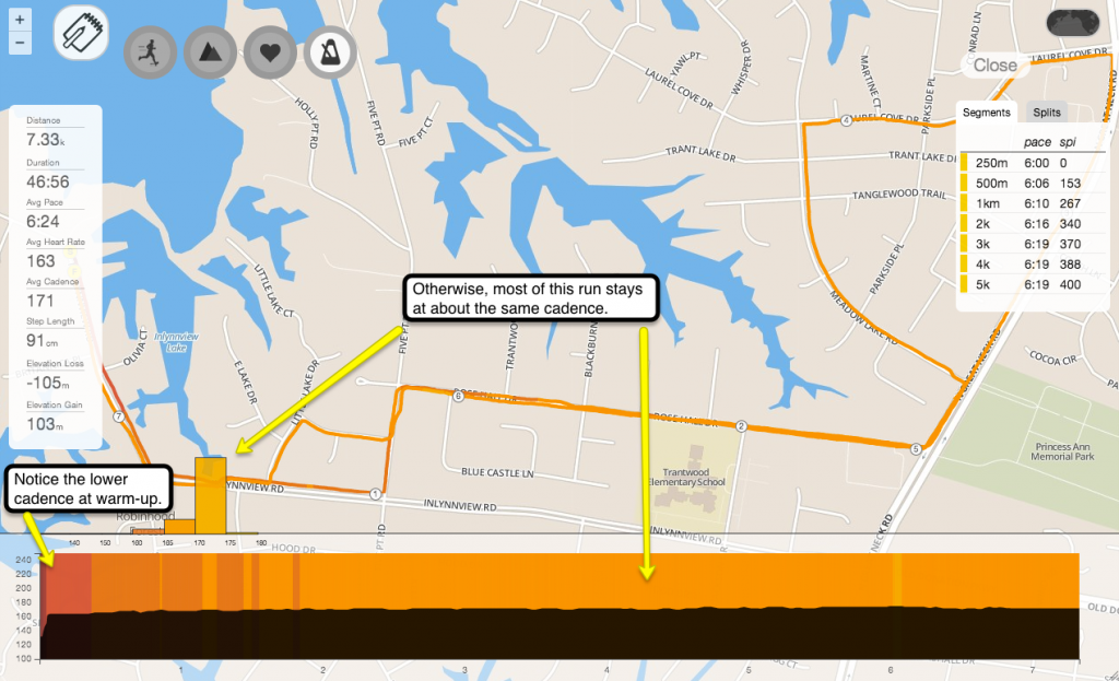
With the exception of a few situations, such as a full-out sprint, a challenging trail, or a slow jog to warm-up, a steady cadence is usually a good indication of efficiency because it suggests that you’re expending approximately the same amount of energy regardless of pace.
When you look at your cadence distribution, it should often appear almost like a straight line. Easy runs usually have the steadiest cadence like this one.

The thing to keep in mind is that sometimes, it’s important to keep cadence steady to conserve energy. Just remember that, like everything else, it’s just another variable to help you evaluate your overall running efficiency. Here’s a quick brush-up on cadence and running economy: http://www.irunfar.com/2011/03/improving-running-economy.html
These are only a few of the things I tend to analyze using the Pro Map. You could also look at how your HR responds to hill difficulty or pace variability. Or view how your stride length changes depending on your cadence. How do you normally use the Pro Map? Let us know in the comments.
Got questions about other use cases? Send me an email at jacklyn@smashrun.com.

Hi,
great info and context on Pro. I have to admit, what holds me back on clicking ‘buy’ is that even with a great input app like iSmoothrun the spotiness of the phone ‘GPS’ is high especially when running in locations with lots of high buildings and trees (see the first couple of km’s in ) or the elevation data on a run which has daft climbs and descents (300m!) on a virtually flat course. Ditto where the 400m circuit was off by 80m or so for each loop.
I am assuming the above is all taken off a Garmin (or other) watch which gives significantly better data but I am guessing for many of us in built up areas with an iPhone 5 or similar the impact of this great analysis (and I think it is!) is limited? Still looking at GPS fixes but I think it will be expensive? 🙂
Cheers,
Ben
PS – any chance of persuading the team at iSmoothrun to include an auto upload to Smashrun?
The problem with looking at run data tracked by mobile apps is that Smashrun Pro will do a pretty good job of exposing the quality of the data that’s being collected.
Most mobile apps have a higher tolerance for fewer trackpoints and some just grab a trackpoint whenever there’s a GPS fix. That just leaves us with less to work with. That said, a lot of mobile apps are getting much better at handling loss of GPS with each release. Some runners have also had success with pairing a mobile app with a compatible footpod.
Unfortunately, running around between city buildings can compromise the overall integrity of data collected by any mobile app. Honestly, even with a Garmin watch, you’ll still get the occasional odd data point when you’re running between skyscrapers (lots of long runs I’ve lost to NYC).
Although, as I said, run tracking technology is definitely getting better. in the meantime, Chris is already in touch with the developer of iSmoothRun and they’ll put together a schedule for releasing an “Import to Smashrun” button 🙂
The most amazing thing is: I didn’t know there was a Pro Map feature until I read this blog post. Yes, I saw the route outline on the run summary page, but it never occurred to me to click on it.
The features are definitely great, but you need to lead your users to discovering it.
Absolutely. We have to work on that. Leaving as many breadcrumbs as possible while trying not to overwhelm users is something we’re still learning to balance. Although, I think it certainly wouldn’t hurt to put a little video/screencast icon on the header of the route map to lead users into it!
I use the Pro Map most of time to have some quick information about my running pace on a specific place of the run (during speedwork seances for example) and for getting info about how often I reach my 90% HR Zone.
Initially, I didn’t understand how the hill grade feature works, but this article explains nicely how to use it, as well as how to use the buckets the way we need it.
The strange thing for me is: I never saw the Cadence button next to the 3 other buttons. Does it require some specific material to make it work?
Hi Greg – I’m glad the post helped a bit! You’ll see the cadence filter if your run has cadence data. Some Polar watches track # of satellites and there’s a very (very) rare satellite filter that also shows up if you happen to run with one of those watches.
[…] Je pense que ça participe à la construction de la confiance. Les auteurs du site ont fait un joli billet avec des conseils pour utiliser leurs outils, vraiment pas […]
Jacklyn – It’s great to see you guys adopting Purdy-Points inspired index! If you haven’t seen it before, you should track down a copy of Purdy’s book “Computerized Running Training Programs”. Oh, here are some Amazon copies: http://www.amazon.com/Computerized-Running-Training-Programs-Gerry/dp/0911520007/
It’s a pretty amazing book; the bulk of its pages are line-printed tables of performance points _and_ very detailed prescriptions for interval and distance workouts based on performance index and target event, incorporating heart rate as a recovery marker. I daresay it could very fruitfully be translated into an algorithmic training program generator….
Anyway, I’m pretty sure it’s up your guys’ alley and I can’t recommend it strongly enough.
I hadn’t realized that it also accounted for heart rate data. I’ll definitely grab a copy and take a look!