The Analyze Run View is one of the most powerful features of Smashrun Pro, and it’s now available directly from the By Run page. The great thing about this feature is how quickly you can see a wealth of information about your recent training.
The view is composed of two parts. The top half shows a distribution of all your runs in the past 90 days based on a metric that you select. You can select either distance, pace, heart rate, or SPI and immediately see the distribution of that metric for your past 90 days training.
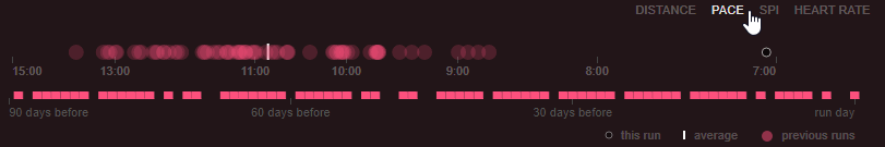
The bottom half shows a timeline of when you ran over the past 90 days. You can hover over any of these days to see the details of the runs on that day.
The magic happens when you use the two parts in concert. Using the top half you can select any part of the distribution, for example you can select distances over 10k or average heart rates in certain zone say, 140 – 160bpm. When you highlight these runs, the timeline lights up to reveal when those runs occurred.
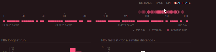
Now that you’ve selected the stat you’re interested in, you can see aggregate date for that selection: total duration and distance, as well as the count of runs, and what percentage of the total training fell into the selected range.
You can use all of his in a number of ways, for example you can see:
In the leadup to a marathon you can quickly see how many runs were over 20km and when they occurred.
If you’re preparing for a 10km you could check how many hours of runs were at your approximate race pace.
Or if you’re alternating runs and walks, you can highlight a pace band and quickly see what percentage of your runs were walks compared to runs, and see how much time you spent doing each.
i cant see this
@Anup Pokhrel, I couldn’t either. Looked for it for so long.
It’s on the page it self, and not a button. Scroll down to “Runs in the prior 90 days”, where you can see it.
Neat! Thanks for the new feature — one more way to visualize.
Minor typo in the information pop-up under the (i) icon: “an indiviual run”
Thanks!
Nice feature – yet another innovative visualization that makes me love this platform so much! Would be amazing to be able to filter down even further with my tags somehow. For example, how much time /distance did I spend on runs I tagged as “Easy” vs “Tempo”, “Interval”, “Threshold”, etc.
I’ve just resubscribed to pro after a break. Looking at this view, I can only see up to yesterday’s run, even though the page I’m looking at is today’s run with all of the correct details. I’ve re-sync’d the page but I still don’t see today’s run in the bottom half of the graph. What gives?