To improve, we learn to push our limits until we pass certain thresholds, just enough to stimulate adaption, but not so much that we cause injury. Consequently, we rely on various forms of measurements to properly manage training load such as training volume, Training Impulse (TRIMPs), Ratings of Perceived Exertion (RPEs), Training Stress Score (TSS), and Training Effect (TE), among others. All of them, in one way or another, attempt to answer the same question: are you training hard enough so that you are improving?
As with all models, they each have their shortcomings, one of which is how averages are frequently used. This is an important point because it is the main difference between every “training score” calculation compared to Smashrun’s Training Bands.
Unlike TRIMPs and all of its variations, Training Bands do not attempt to rate your training effort. Instead, it is a detailed account of your effort distribution. To understand Training Bands, it is best to look at how we approach training sessions.
Tracking Effort Distribution with Training Bands
For the sake of simplicity, imagine that you are planning out your running schedule for the week and you decide to allocate 70% of your training volume to your aerobic zone, 20% to anaerobic, and 10% to your max. The easiest way to track this is to look at individual runs as a session and categorize them in some way such as easy, tempo, and speedwork.
A more granular approach would be to track your effort distribution for one run, which is what most training platforms do. Again, to keep it simple, we will only look at three zones: easy, moderate, and difficult.
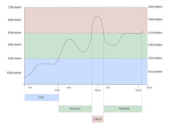
This is often useful for looking at one run but, when you are training for an event, looking at an isolated instance is less than ideal. One 10 mile run could be broken into multiple segments within the same session to include a warm up, several pick-ups, a short tempo, and a cool down.
How would you quantify the contribution of each of these segments if you’re only looking at each run as a whole? This is where Training Bands do the hard work.
Training Volume by Effort
Smashrun looks at each trackpoint of every run and allocates it to a bucket, which we call a training band. It does this for pace, heart rate, and hill grade. Using our previous example, if we took all of the easy zones from a bunch of different runs and added them up across all runs, we will end up with one training band.
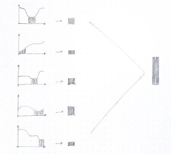
This becomes tremendously complex with actual running data, because one run could have thousands of trackpoints. Your entire training history could be hundreds of thousands of trackpoints. Each of those trackpoints go into a specific band. When you combine all the bands together, you get Smashrun’s Training Bands.
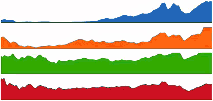
Another way of visualizing it is to look at individual area graphs, which you can actually do when you click on specific bands. Each color represents one band. When stacked together, they represent your total training volume.
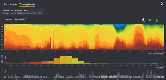
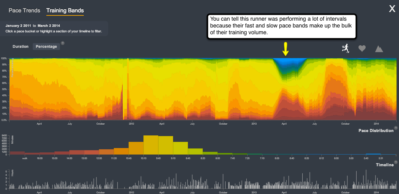
Training Bands illustrate volume at a different level, because you are not just looking at total duration of all runs. Instead, you are looking at the total duration of runs at different training efforts. Whether you are viewing your Training Bands for pace, heart rate, or hill grade, each band represents how hard you performed, for how long, and for what percentage of your total training.
Combined with training volume based on heart rate zones, it is possible to use Training Bands to get a sense of your training load. This, of course, is not a direct calculation of your load. Instead, it is a quick way to visualize your effort distribution and training intensity over different training cycles.
As I mentioned in last week’s post about using Pace Trends, overload (the tipping point at which you start to improve) happens with planned recovery periods.
Use Training Bands to see when you spent more time running hard so you can better manage your future training volume.


Identify the time periods when you did the most speedwork. Did it help your overall training? Or did it set you back because you were too burned out afterwards?
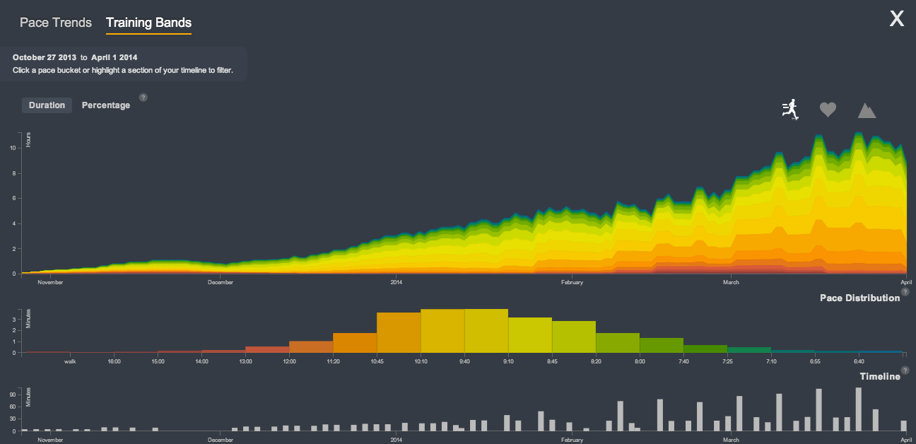
Have you ever wondered what someone’s training might look like if they stick to the 10% rule to gradually increase volume? It’s like something out of a textbook.
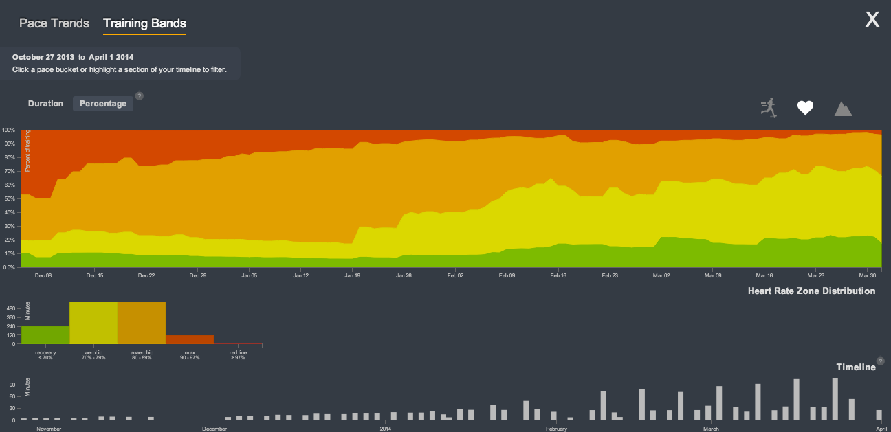
It gets even more interesting when we look at the same person’s Training Bands for heart rate, viewed as a percentage instead of absolute duration. You’ll see that they ran less in the beginning but spent a lot of time near their max, whereas they’re running much more now but spend much less time in the red zone. By running more, aerobic capacity just naturally increased, which is as it should be!
Training Bands is really where Smashrun bridges the gap between small data (your individual runs) and big data (your total training duration by effort distribution). It is a much more meaningful representation of your training volume because it shows you how every second of every run contributes to your training as a whole.